Today, I submitted the my economics thesis for review, in completion of Lewis & Clark’s Economics program. Hooray! Here is the final document.
I also presented my findings at a poster session. For an abbreviated version, see my poster below.

The Stories and Scholarship of Aaron Fellows
Today, I submitted the my economics thesis for review, in completion of Lewis & Clark’s Economics program. Hooray! Here is the final document.
I also presented my findings at a poster session. For an abbreviated version, see my poster below.
Whereas a typical paper published in an economic journal might devote a few lines to the economic theory on which their research is based, an undergraduate economics thesis is intended to demonstrate mastery of certain models of theory. I started thinking about this as I was starting to feel that I had conquered the behemoth of my data analysis, and realized that I had done minimal reading concerning the theory in which I was grounding my experiment. So, I began to delve deeper into how I was connecting my econometric model to the theoretical model of Hedonic Analysis which is presented in literature.
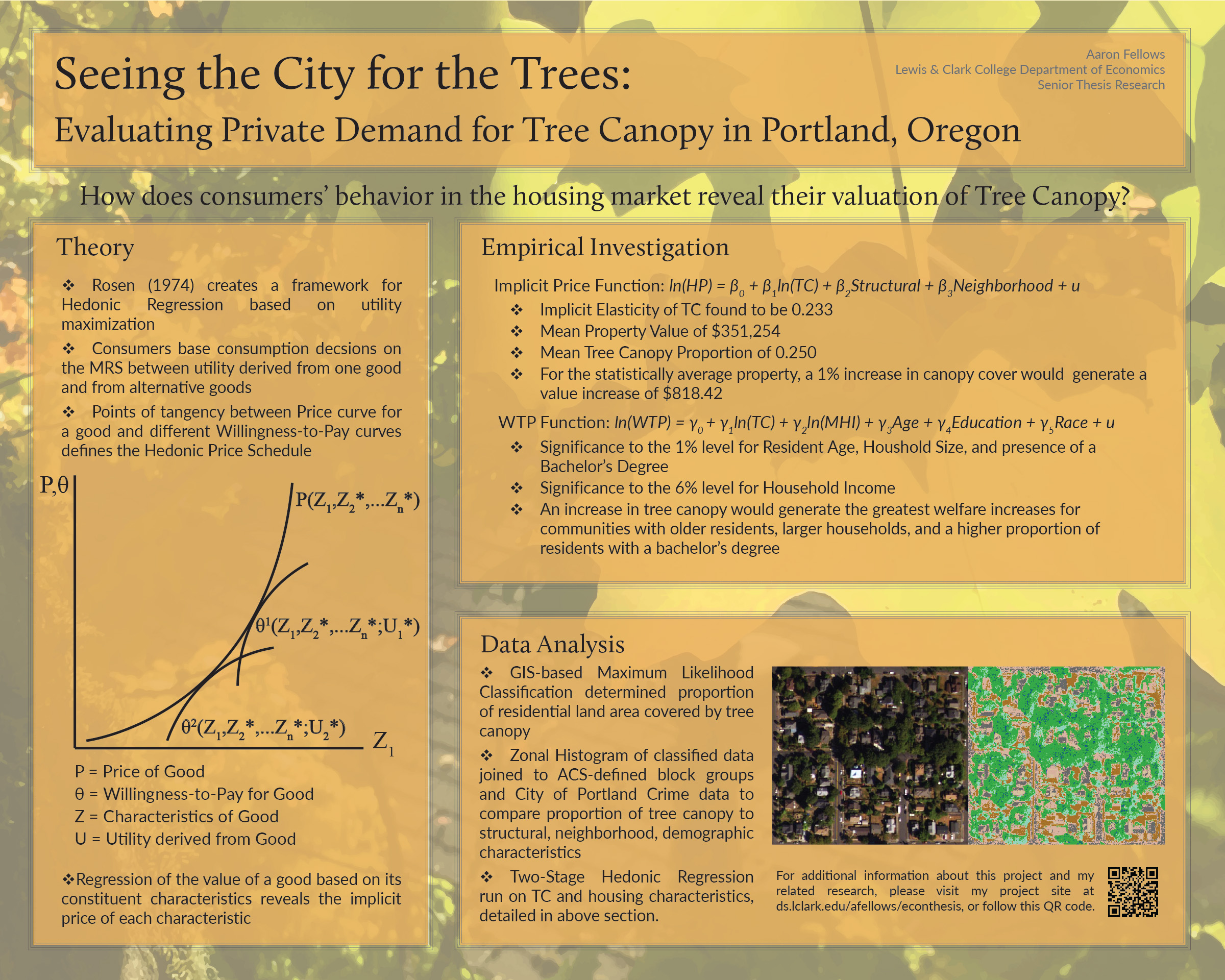
 In the case of Hedonic Analysis, the best model is arguably the first, and I returned to the seminal paper on Hedonic Analysis published by Sherwin Rosen in 1974. Rosen connects the framework of hedonic regression to the utility maximization model, showing that the housing market can reveal the value of its constituent characteristics in a perfectly competitive market equilibrium (see the figure to the left). I go into more detail in my Theory section, but suffice to say that I have spent much of my recent energy on this project in connecting with grounding theory

If I was going to analyze the distribution of Tree Canopy in Portland, I knew it would be necessary (or at least extremely uselful) to be able to quantify that distribution. So, after much struggling with ArcGIS’ Maximum Likelihood Classification tool, I managed to classify a raster image of Portland. This means that I am now able to determine, for any given area of Portland, how many pixels of my twelve-gigabyte raster are showing up as tree canopy. This is a proud moment in my analysis, and I see it leading to great things in the future.
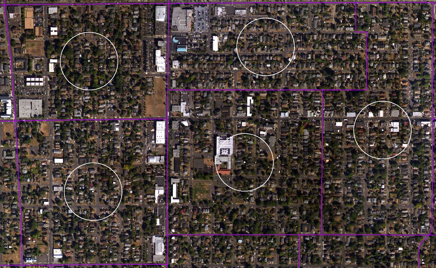 For my first attempt at quantifying the amount and distribution of Portland’s tree canopy, I used the GIS methodology I know best, which involves drawing polygons within a sample area. My basic unit of analysis for Portland was and is the American Community Survey Block Groups, shown above outlined in purple. After obtaining a geodatabase of Block Group data from ACS, and constructing a giant raster of Portland Orthoimagery based on USGS Aerial Photography, I created a sampling area within each block group. I did this using ArcMap’s Centroid tool to interpolate a point in the geographic center of each block group, and the Buffer tool to create a 100 meter radius around each of those points (shown above in white).
Now came the process of drawing polygons. This means that, for each sampling area, I was quite literally tracing each tree so that ArcMap would know it was an area of canopy. A problem with this methodology quickly emerged when I discovered that covering a single 100-meter-radius sampling area in polygons would take me about an hour—and Portland has 994 Block Groups. Not being able to spend my time from now until March tracing trees in my data, I decided I need a new methodology. It’s time to investigate Image Classification!