This fall I undertook an independent study under the guidance of ENVS program director Jim Proctor. The goal of this 499 was was to supplement my reading for thesis, motivate me to expand upon the readings in a different scholarly direction (social network visualization) than traditional analysis and synthesis, and help me get a few credits for doing what I love!
The focus of this independent study was on Architectural Theory, and specifically a branch or sub-category of architectural theory known as architectural phenomenology.Beyond providing an opportunity for me to explore this area of architectural theory and develop my vocabulary in architectural phenomenology and skills in architectural phenomenological research, this independent research represents an effort to mobilize my work (if only reading could be my work forever!) in a new way. That is, instead of synthesizing the knowledge I’ve gained from these readings in a formal paper (which I will do as a section of my thesis!) I took these readings and mapped (or visualized) the social network that connects them. This way of understanding a body of literature has many benefits.
For one, creating such a survey, much like a literature review does in formal scholarship (not to say this style of research isn’t formal scholarship, but perhaps can be understood as emerging, or non-traditional…), allows us to understand who is writing about a specific topic. Unlike a literature review which engages the content of each piece (this is certainly important in my visualization project as well, but again, in a different way) this survey of who is writing in a specific area of scholarship can point to important demographic patterns. This represents a different descriptive dimension that is equal parts about the who of a given area of academic inquiry as it is the what. For example, we may look at architectural phenomenology and see that it is dominated by white males (the individuals who produce the most scholarship and are cited most frequently), however other demographic categories are also represented. Furthermore, such network visualization provides a more crystalline perspective of the how works interact within a field. Scholars well versed in a specific realm of thought may well have constructed such a network in their mind after reading around and understanding patterns of citation and recurrent ideas, however actually putting this network in front of us on a screen can instantly help recognize more subtle or latent patterns not explicit or obvious from mere reading. Such visualization can provide insight into how tightly woven (hopefully not hermetically sealed!) an intellectual (more correctly, academic) discourse is. How closed is this conversation? Which works are cited most often? This could be understood by identifying which “nodes” (nodes represent specific texts or publications such as books, chapters, articles…) are most central. Presumably the nodes with the most citations would have the highest centrality within the map/visualized network. An interesting question here is whether or not the most widely cited works in general are also the most cited within the network. We’ll see later! Again, presumably these more centrally located nodes represent the foundational literature of a field.
Building off of, or moving outward from, this foundational literature we would expect to see more recent publications, or texts that engage with a specific problem and generate insight which is not easily generalizable. Such an analysis can help identify knowledge gaps within academic discourse, guide the conversation, and foster intellectual rigor. What scholars want to avoid, pardon my naïve assumption, is writing in bubbles. That is, scholars should want their work engaged with, criticized, and most importantly to be relevant to larger conversations. By visualizing these networks, we can see who is off in her own little world, and bring her back into the conversation; we can identify areas that receive lots of attention, and those that receive little attention, and fundamentally identify critical trajectories in which to pursue more research.
The practice of academic network visualization still has plenty of room for development. There are scholars, though, who are working hard defining this field. I drew considerable insight from the works of two academics in particular: Amanda Visconti and Jill Walker Rettberg.
Amanda’s work revolves around her doctoral dissertation research into the social network of characters in James Joyce’s novel Ulysses. Amanda’s work in Gephi (the program I’m using to visualize the network of literature) that she shares on her blog (linked to above!) has been very helpful throughout this project.
Jill’s work (again, linked to above) provides a precedent for the work I’m doing by mapping works, she focuses on dissertations, published within the Digital Humanities field. Jill has created a Gephi map that she has kindly shared, allowing me to get a feel for the program before completing my own data (in the form of a spreadsheet which I’ll share and talk about below). Jill’s work concentrates on the themes electronic literature dissertations deal with, as well as the network of citations in the field. Jill identifies some interesting correlations and clusters within her data set, and I highly recommend you check out her work (linked to above)!
Now let’s take a look into my network. Like I said, I focused on the sub-category of architectural theory known as architectural phenomenology. I included 26 works in my analysis, and generated 95 edges. I gave each edge (the link between nodes) a direction and a weight. That is, each edge represents a direct citation (A cites B) and the degree to which the cited work influenced the citing work, based on my subjective interpretation. To generate the weight value I simply read the article and rated the node based on how important I felt the cited work was to the citing work. I gave either a 1, 2, or 3; 1 meaning little influence or a passive ciation, 2 representing works that contributed significantly to the argument of the paper, and 3 if the work seemed foundational to the authors analysis, that is, if a paper so fundamentally relies on another work that if the cited paper were to disappear from existence nothing in the citing paper would be possible to say or claim. Accordingly, values of 3 are more rare, 2s occur infrequently, and values of 1 dominate. It’s worth noting here as well that the texts I chose to include were selected because they appear more frequently than other works. That is, my list of nodes is not representative of all the works cited in these architectural phenomenology papers. There are many more, so the works that do appear already appear in the literature with a greater prevalence and ‘weight’ than others.
Before I get in to more analysis of my data, let me briefly explain the program, Gephi, I used to generate and organize my network and visualization (sometimes referred to as map). Gephi is a program designed for social network visualization and runs on several included algorithms. I am not mathematically or statistically advanced enough in my understanding of how these algorithms function, however I can tell when they look cool. I believe this visceral reaction is, in fact, indicative of the success of the visualization in some way. For the visualizations you see below, I executed the different default algorithms under standard settings.
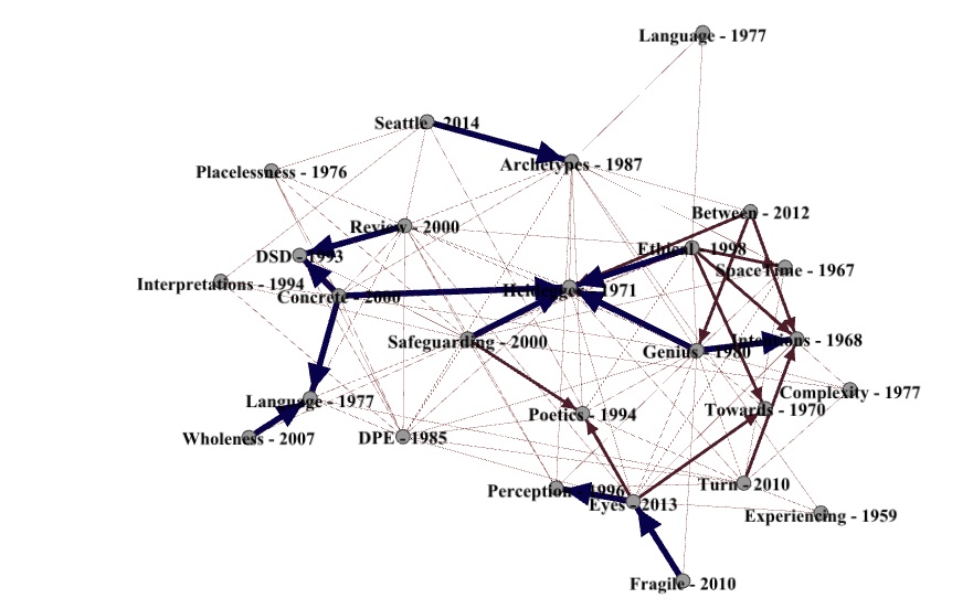
Force Atlas
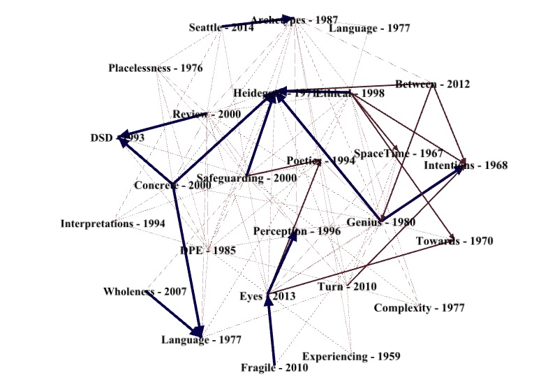
Fruchterman Reingold

Force Atlas 2
As these visualizations make apparent Heidegger’s seminal work “Building Dwelling Thinking” is very centrally located, and connected to by more heavily weighted edges than any other node. Other centrally located nodes include Christian Norberg-Schulz’s book “Genius Loci” and Karsten Harries’ book “The Ethical Function of Architecture.” Both “Building Dwelling Thinking” and “Genius Loci” are highly cited in general, but are not the most cited. Maurice Merleau-Ponty’s book “Phenomenology of Perception” is the most widely cited work I included, but within my network is only cited 6 times. Heidegger’s work is the most cited within the network with 10 citations. Ingrid Leman-Stefanovic’s book “Safeguarding Our Common Future” cites 11 other works within this network, and is itself cited twice, making it the most connected work in the network. Other interesting patterns arise from visualizing this network; for example, it appears there is a general trend for later works (2007-2014) to appear around the edges of the network.
I imagine more in-depth and sophisticated analysis of this map can yield valuable insight into this particular academic discourse. As this wikipedia page on social network analysis shows, there is quite a lot of potential and theoretical applications for this sort of scholarship. I hope to continue developing this project as I move along with my thesis. Hopefully I will produce something of value to this conversation, potentially identify knowledge gaps, highlight a need for openness (you can never have too much) and provide opportunities for the spontaneous and serendipitous combination of new ideas.
Thanks again to Jim Proctor for advising me throughout this project. I’m excited to see how this project evolves and how SNA (social network analysis) plays out in the future in the environmental studies department, at Lewis and Clark in general, and in larger academic conversations.
In hope that my work will be engaged with and useful to other people, below I’ve included the files I used in my project for your fair use under creative commons. WordPress won’t let me upload the .gephi file “due to security reasons” so if you know how to work around that let me know. Otherwise email me and I’l be happy to send it your way. Please attribute, and happy mapping.
Thanks!
-Ben