Liza Tugangui, Audrey Stuart, Blake Slattengren
Background
Social networks provide a myriad of information about a population of people. Social network analysis allows us to study the connections between people and ideas, of which we can then draw theories about the reasons behind these connections. In this lab, we collected data from the ENVS 220 class, this data spanned a few different areas of life from how many siblings one has, to interest in a particular environmental topic, to whom an individual shared a close friendship with. These areas of life just allowed us to get a general sense of a classmate’s interests as well as see some connections between students and possible reasons behind these connections. Using yEd, a social network analysis program, we were able to create visual graphics to more easily examine the connections between nodes, or people in this case, as well as see the weight, or comparative significance, of these connections. Along with the visuals, statistical data analysis was used to further evidence the theories that were brought up from the yEd graphs as well as providing more insight into the questions brought up from these graphs, like the significance of the placement of node and if that held correlation to other nodes. Essentially, social network analysis allowed us to see connections between our peers and possible explanations behind them.
Procedure
The lab began with everyone taking a survey outlining our friends, people with similar interests, people we would like to work with, concepts we are interested in, and background information. All this data was compiled in a spreadsheet. We then took the information for the people we connect with and made an adjacency matrix for each of those three categories. These matrices were then uploaded to yEd where we could analyze the data in various one-mode networks. After this, we created a matrix that included how everyone rated their interests in environmental studies and analyzed this in a two-mode network.
Results
Diagram 1: Who ENVS 220 students would most like to work with in the future
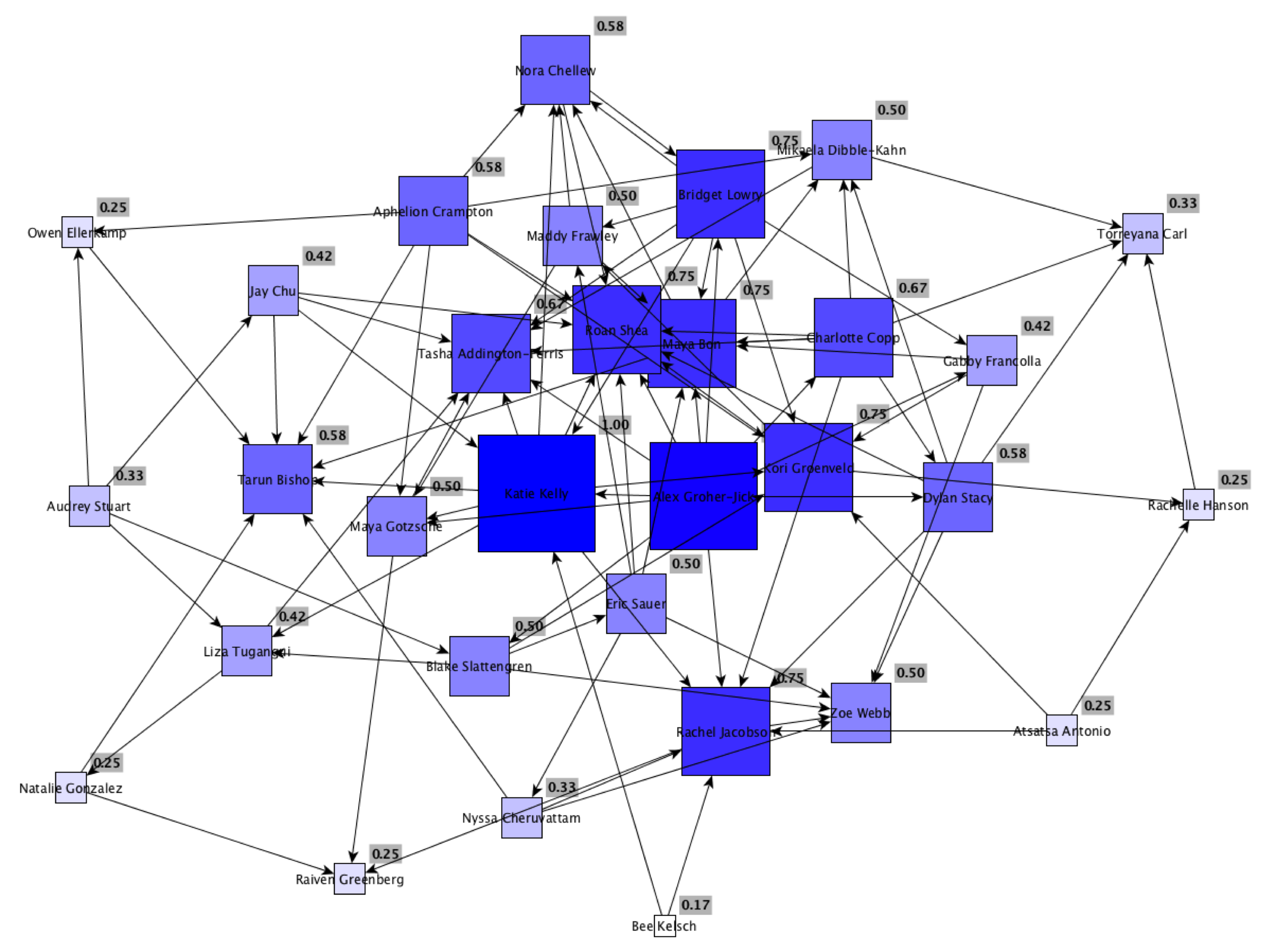
Diagram 2: Those who were listed as close friends
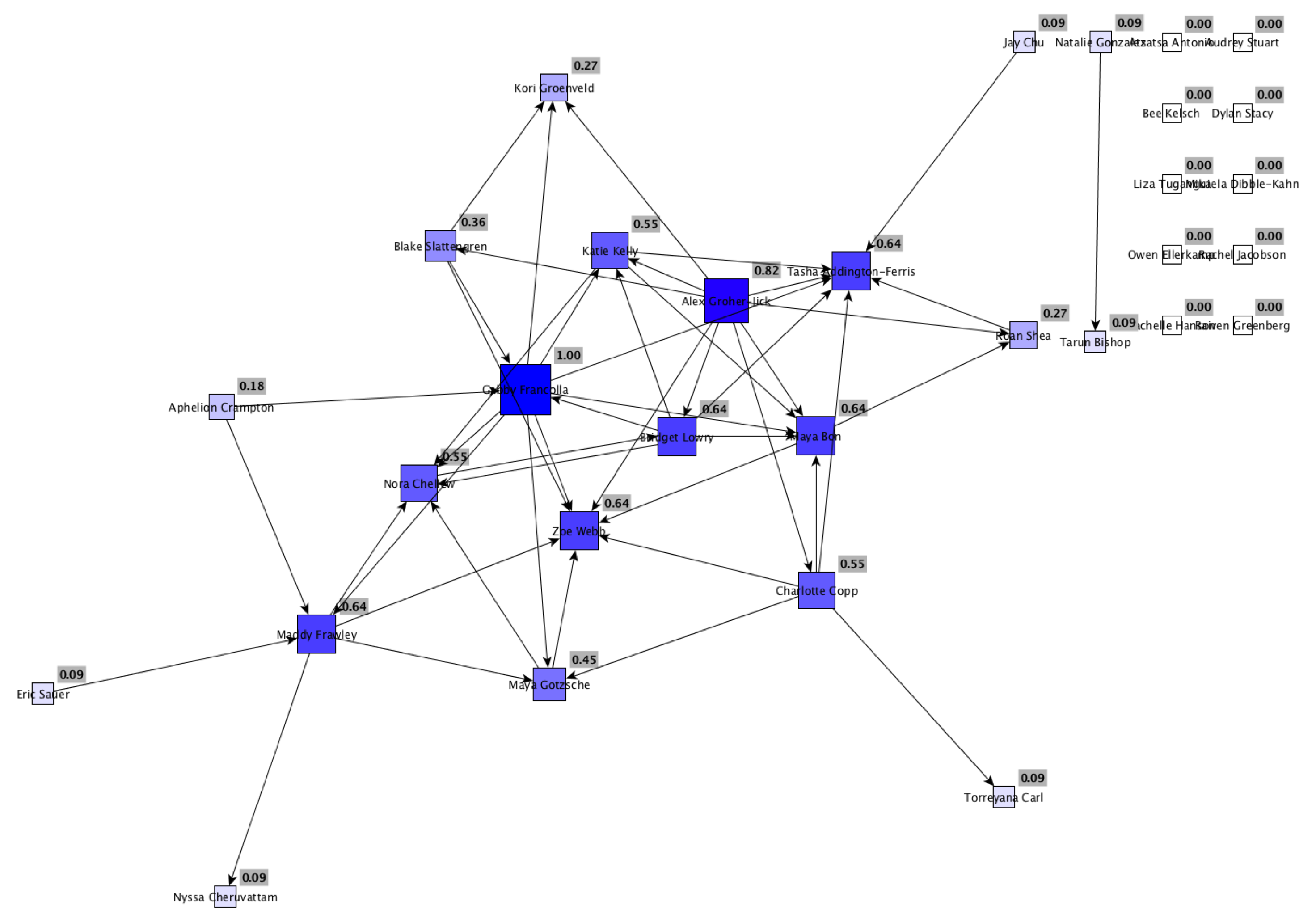
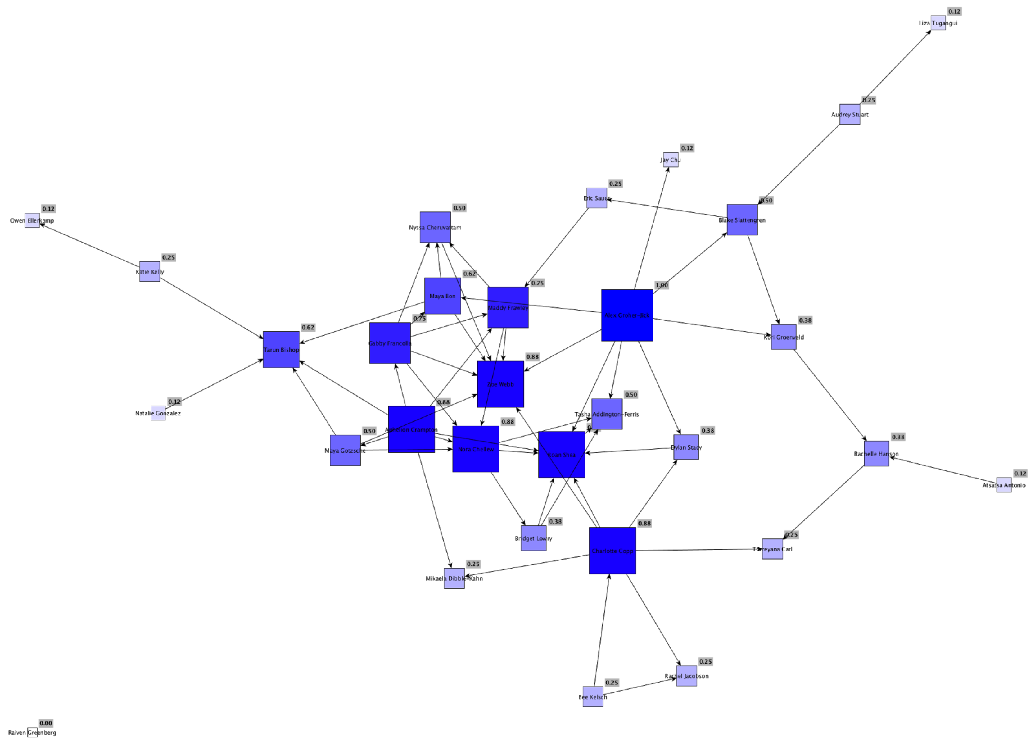
Diagram 3: Students who were perceived to share similar interests
This lab used centrality measures to find the most central nodes, or students, in the one node diagrams. The first of these diagrams represented the students that people wanted to work with in the future. The spacing of this diagram was relatively evenly distributed, though there was one tight cluster of students in the upper middle. A tight node means that particular group of students had many common connections among them. On the other hand, the overall even distribution means that a variety of people were chosen in the survey. Our class appeared to be very well connected. If everyone in the class had picked a specific few people that they wanted to work with, our diagram would look extremely different and would not be as evenly spaced.
The second diagram mapped answers to the question of who people’s friends were in ENVS 220. This diagram was distinct because there were a number of nodes with no edges. This means that these students did not select anyone in the class as their close friends. From the students who did select people as their close friends, they generally only selected a couple. There was a slight cluster of nodes in the center but overall the nodes were very spread out. Our class had much less connections with close friends than with people we would want to work with in the future.
The final one mode diagram showed the common interests among students. This diagram was also quite sparse, so people had more students they would want to work with than students they shared interests with. The center node was made up of about 5-7 students. These central nodes had approximately 5-10 edges each, which includes both those leading towards and going away from them.
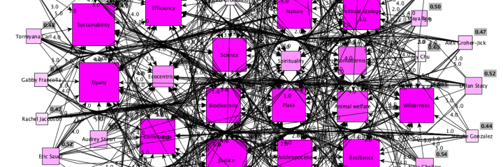
Diagram 4: Students and environmental concepts most interested in
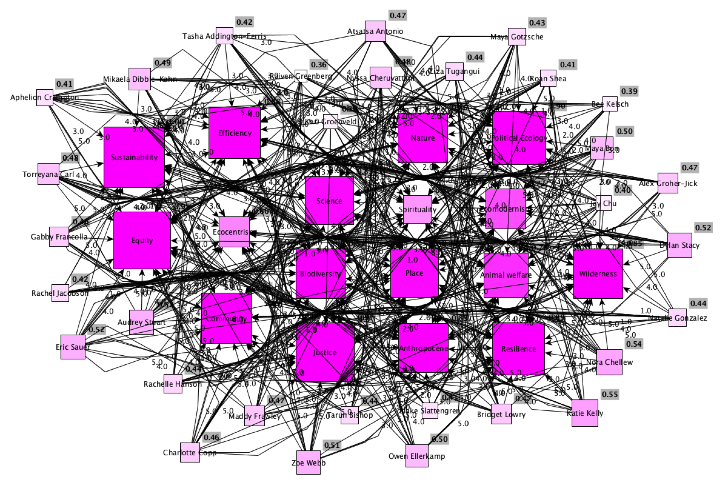
Diagram 4 shows a two-mode network of students and environmental concepts that they had the most affinity for. Sustainability was the most popular node with equity and justice not far behind. Spirituality and ecocentrism are by far the least popular environmental concept nodes. You can also start to make out trends by the nodes placement to each other. For example, science and biodiversity are close, so we can expect there to be some correlation between them. We explore this in the table below. Also people with similar interests tend to be grouped near each other.
Diagram 5: Chart of Correlations
As predicted, this chart shows a strong correlation between biodiversity and science. There is a slightly less strong correlation between nature and biodiversity and again slightly less strong between resilience and biodiversity. This demonstrates that people who feel strongly about biodiversity tend to also feel strongly about science and, to a lesser degree, nature and resilience. This makes sense as biodiversity is often tied to biology and nature and it heavily uses ideas of resilience.
Other interesting correlations we found include a negative correlation between equity and ecocentrism. This may suggest that people who tend believe strongly in human equity tend to put that above the needs of a whole ecology and vise versa. There is also a correlation between community and place. This makes sense and shows that people who believe in the people in their community also believe in the place that houses the community. Our findings are useful because we can predict which factors will matter most to a person by knowing several other factors that they value. This allows us to get closer to the goal of understanding human motivation and the reasons behind people’s priorities within environmental issues.
Discussion
There were several aspects of our methodology that could be improved upon. Many people did not chose an answer for the question of who their close friends were. This made the data much harder to compare because of all the nodes with no edges. This question could potentially be rephrased to ask “who are you most close with in ENVS 220?” Changing the question slightly could prompt more students to answer it so we can have a more robust dataset. Another potential issue was the lower number of edges in some diagrams. For example, the diagram showing common interests did not have a large number of edges, even between the most central nodes. This may possibly affect the analysis because we are comparing diagrams with vastly different numbers of edges. This could overestimate the centrality of nodes because it is easier to be very central if there are fewer total edges.
In addition, while yEd was great at portraying relatively small, one-mode networks, the two-mode network with more nodes and edges became very cluttered. This made it much harder to interpret our data and see correlations without calculating them. The use of another application would allow for cleaner and easier-to-interpret two-mode networks.