Background
Air pollution is an increasingly prominent issue because of its implications on human health, among others. According to the State of Oregon Department of Environmental Quality (DEQ) study of Portland’s air pollution and toxics concentrations, Portland’s air quality has increased in the past three decades, but certain pollutants are notably higher than both ambient benchmark concentrations (ABC) and national healthy benchmark concentrations. Furthermore, this study found positive correlations between high concentrations of pollutants and the presence of low-income or minority neighborhoods. In this lab, we utilized ArcGIS to convert tabular data of the presence of air pollutants in Portland neighborhoods into spatial data in order to understand potential relationships between race and air pollution.
Methods:
Using the metro Regional Land Information System (RLIS), we gathered mapping data for freeways, major rivers, and county lines. This information allowed us to provide geographic context for other data. We mapped toxin production sites found on the EPA’s Toxic Release Inventory (TRI) Program and compared these with toxic risk gathered from Portland Air Toxin’s Solution. We compared the presence of butadiene and diesel particulate matter (DPM) in neighborhoods dominated by Asians, by people making <$20,000 a year, and by people making >$200,000 a year. Additionally, we compared the same particulate matter data with total population. As a contrast to the butadiene and DPM, we chose to compare the presence of cadmium against neighborhoods dominated by African Americans.
Results
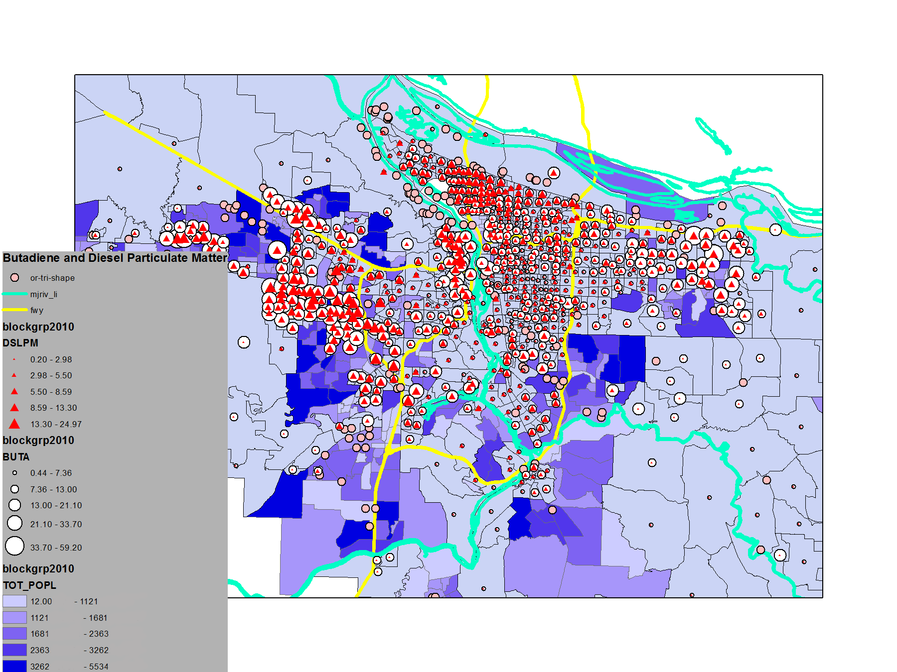
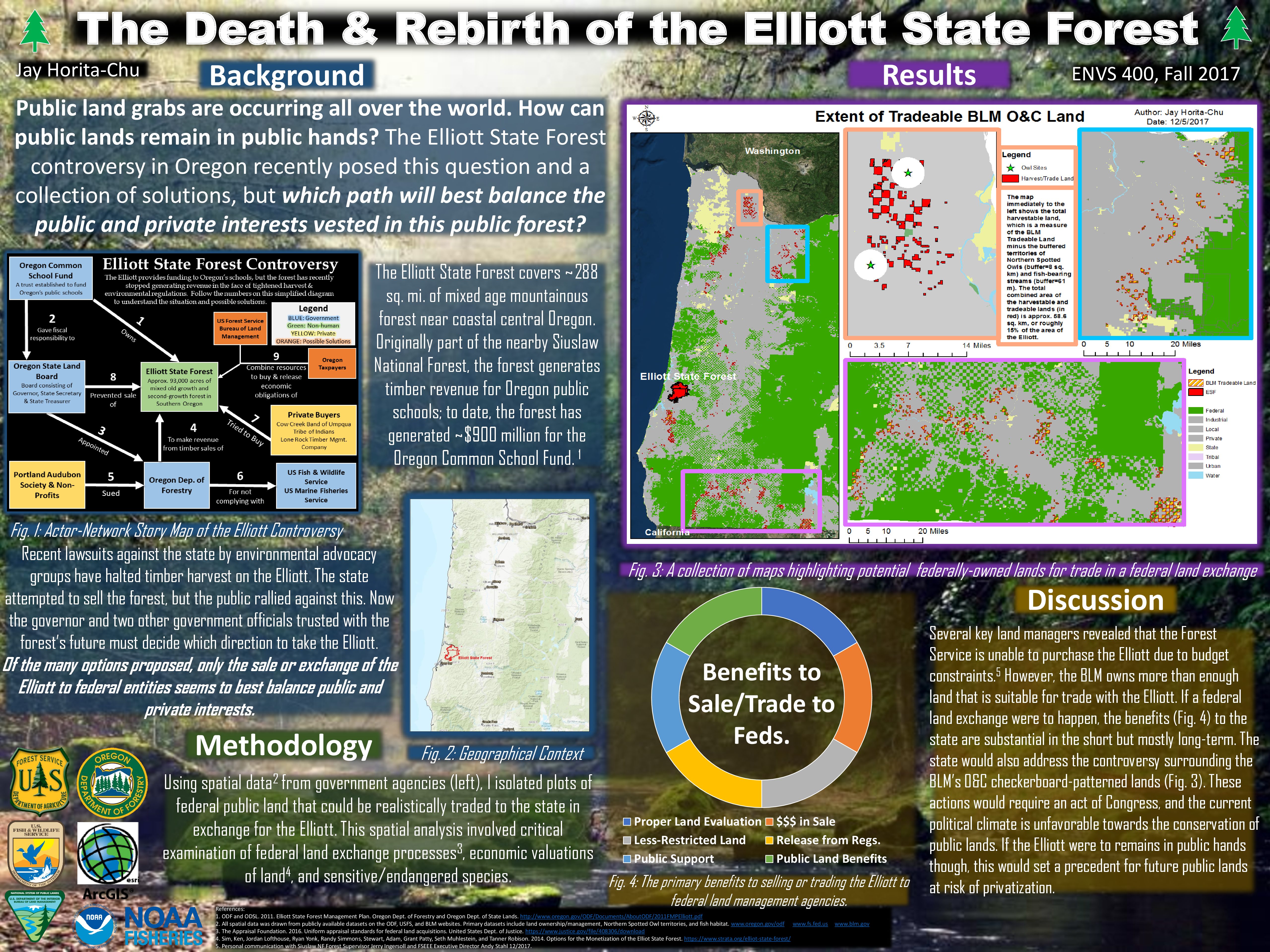
Fig. 1
Figure 1 shows the total population in Portland neighborhoods. The darker the shade of purple, the more densely populated the region. The white dots represent butadiene. Regions with higher levels of butadiene are labeled with larger white dots. The red triangles represent diesel particulate matter. Similarly, regions with higher levels of diesel particulate matter are labeled with larger red triangles. The teal lines represent rivers, the yellow lines represent freeways, and the pink dots represent factory sites.
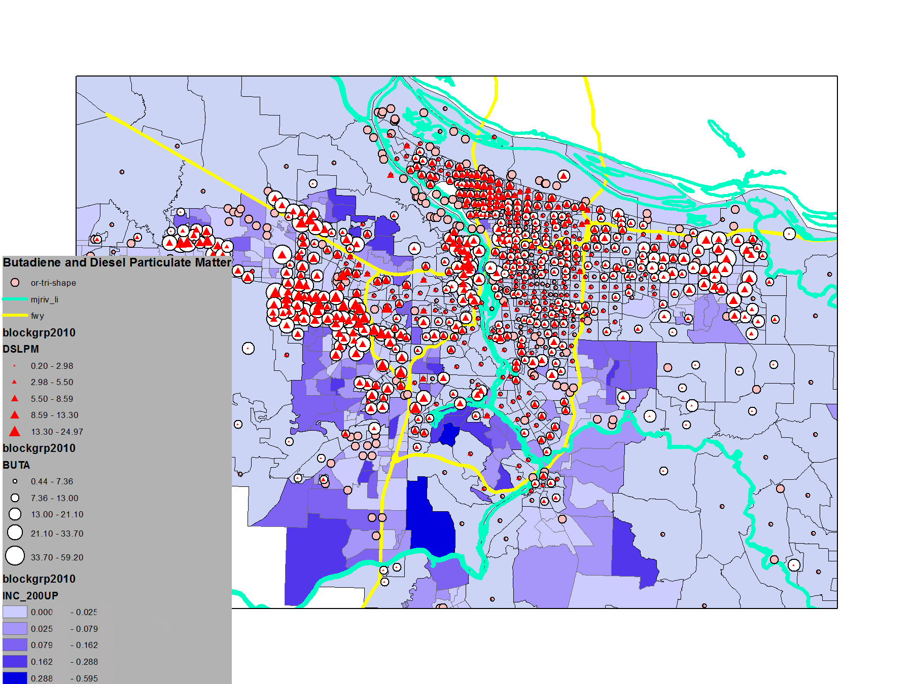
Fig. 2
Figure 2 shows average household income of $200,000 or higher. The darker the shade of purple, the higher the average household income of the particular region. The white dots represent butadiene and the red triangles represent diesel particulate matter. The teal lines represent rivers, the yellow lines represent freeways, and the pink dots represent factory sites.
Fig. 3
Figure 3 shows the average household income of $20,000 or lower. The darker shade of purple represents average incomes of $20,000. The lighter shades of purple are incomes under $20,000. The white dots represent butadiene, while the red triangles represent diesel particulate matter. The teal lines represent rivers, the yellow lines represent freeways, and the pink dots represent factory sites.
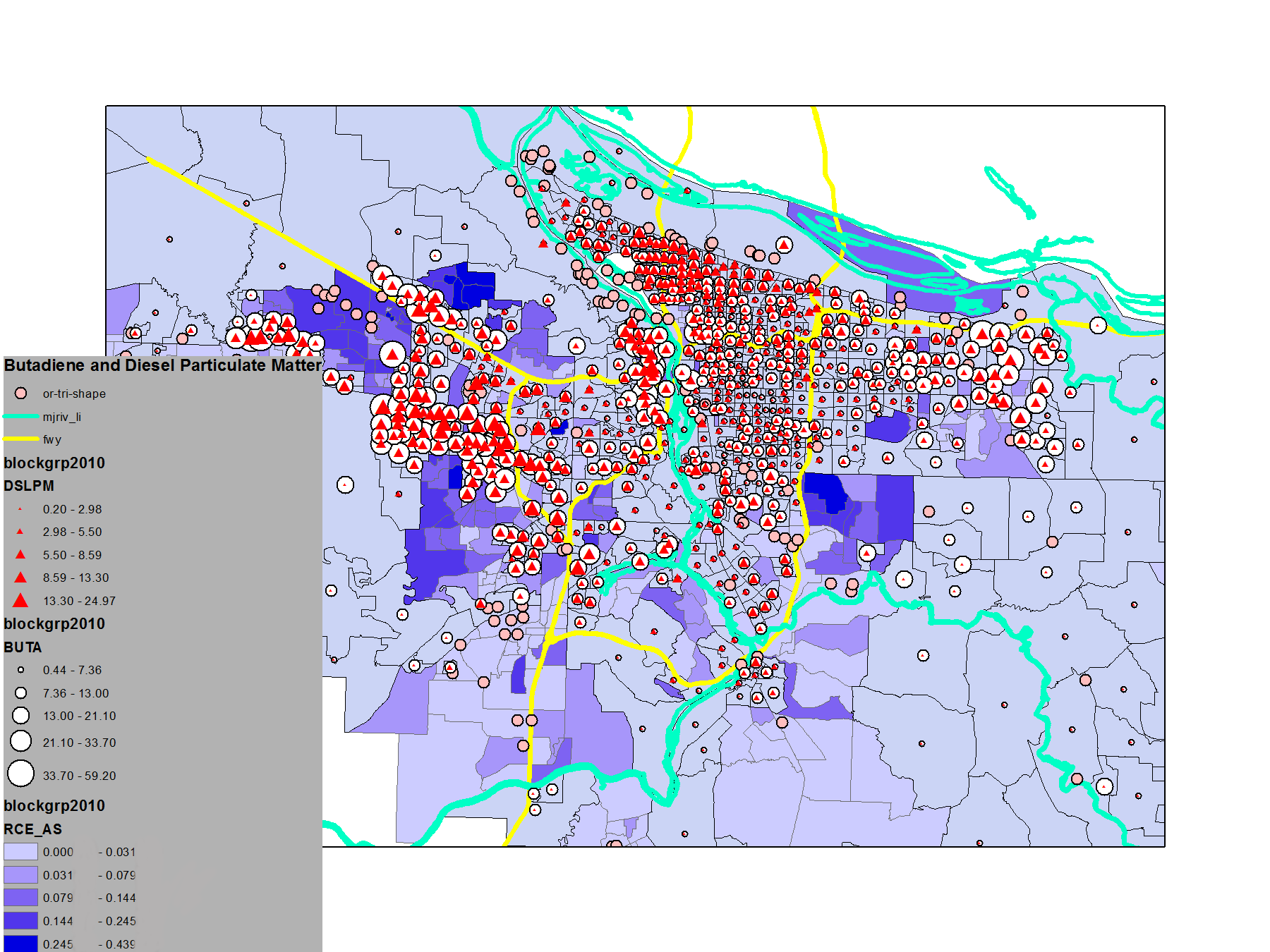
Fig. 4
Figure 4 shows the number of people in the region who identify as Asian. The darker the shade of purple, the higher the population of people who identify as Asian. The white dots represent butadiene, while the red triangles represent diesel particulate matter. The teal lines represent rivers, the yellow lines represent freeways, and the pink dots represent factory sites.
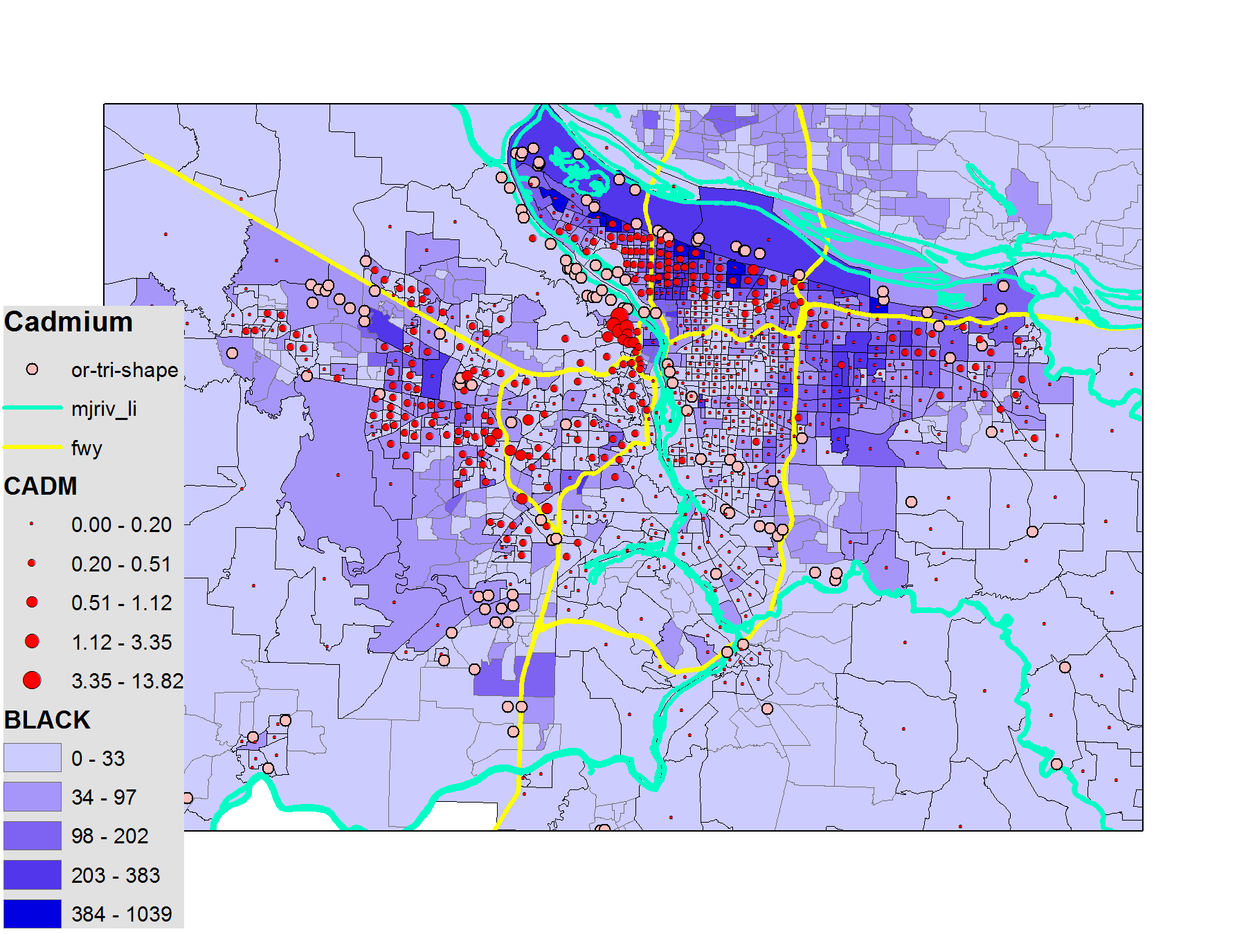
Fig. 5
Figure 5 shows the number of people in the region who identify as Black. The darker the shade of purple, the higher the population of people who identify as Black. The red dots represent butadiene risk. The teal lines represent rivers, the brown lines represent freeways, and the green lines represent factory sites.
Discussion:
According to the DEQ report, minority neighborhoods had disproportionately higher concentrations of air pollutants; furthermore, these neighborhoods were split into categories by race (white, black, hispanic/latino, asian). When comparing these findings with our spatial data, we can find that in Fig. 4 and Fig. 5, non-white neighborhoods do have seemingly higher presences of air pollutants. In Fig. 5 the cadmium concentration seems to be positively related with black neighborhoods but not others, but this example is not constant with other air pollutants and race combinations.
While butadiene and diesel particulate matter did not necessarily correlate with any specific populations, cadmium did. We presume this may be due to the fact that butadiene and diesel particulate matter are distributed through automobile exhaust, while cadmium is generally linked with a factory. In other words, diesel particulate matter and butadiene are spread without correlation to a certain population presumably because they are not necessarily linked to the presence of a factory. In contrast, since cadmium is most likely linked to a factory, its presence in a specific region could be more closely linked to environmental injustice.
When we compared our spatial data with the DEQ report, we found that the absence of a correlation of DPM and butadiene presence in Asian dominant neighborhoods is opposite to what is stated in the DEQ report. While this may be due to misjudgement on our part of the spatial data, this relationship should be tested again using statistical applications to see if there really is a significant relationship. Indeed, the only comparison we made that was in agreement with the findings in the DEQ report was that comparing Cadmium presence in African-American dominant neighborhoods.
Overall, the lab helped reinforce our ArcGIS skills and our interpretive eyes for finding relationships in spatial data. It was also very applicable because of the setting of the data.