Team Members: Jesse Simpson and Perri Pond
Background
In this lab we used GIS software to investigate the relationships between country-scale patterns of access to drinking water and improved sanitation. These are two vital variables which are included in the Environmental Performance Index (EPI). The EPI is a project that “ranks how well countries perform on high-priority environmental issues in two broad policy areas: protection of human health from environmental harm and protection of ecosystems.” It is a comprehensive index that incorporates everything from biodiversity and habitat protections to carbon intensity to air pollution to water and sanitation to produce a single number representing the “Environmental Performance” of a nation. To gain a better understanding of spatial patterns of the percent of people with access to improved water and improved sanitation, we mapped the EPI data with ArcGIS. The EPI defines “‘improved’ sanitation sources include connection to a public sewer, connection to a septic system, pour-flush latrine, simple pit latrine or ventilated pit latrine.” And access to sanitation is measured by “the percentage of the population that has access to an improved source of sanitation.” The EPI defines access to drinking water “as the number of people using improved sanitation facilities in relation to the total population, expressed as a percentage” and defines an ‘improved’ drinking water source as “a facility or delivery point that protects water from external contamination—particularly fecal contamination.” The quantification of each of these numbers is done rather oddly; the “percent” value expressed by the EPI is an inverse logarithmic transformation of the underlying data, supplied by the WHO/UNICEF Joint Monitoring Programme in this case. The range is still from 0% to 100%, but each value is curved to promote a more even distribution in the range given; without such a curve, the majority of the countries would fall between 80 and 100% in terms of water and sanitation access, a distribution apparently deemed insufficient differentiated by the creators of the index.
Procedure
We began this lab my educating ourselves about the Environmental Performance Index (EPI). After familiarizing ourselves with the EPI we looked through the various EPI indicators and chose to examine the relationship between access to drinking water and access to sanitation. Using the EPI data explorer we observed a variation between access to drinking water score, access to sanitation score, and GDP per capita. Once we had selected our variables we then imported our shapefile (global boundaries) and our xy data (EPI data folder). From there we joined the ISO codes of the shapefile to the EPI data. After that for the remainder of the lab we primarily focused on the aesthetics of the map. After navigating ourselves to the symbology tab in the layer properties, we configured the color ramp, range, and label to our liking, using five “Natural Breaks (Jenks)” to gradate each data set. To translate the inverse-logarithmic “percents” given by the EPI, we referred to the EPI Summary spreadsheet to find the countries which form each of the breaks in data ranges, for both the sanitation and water access sets. We then looked at the raw national values given for each of these countries by the WHO/UNICEF and used these percents in the legend to interpret the data in an intuitive way.
Results
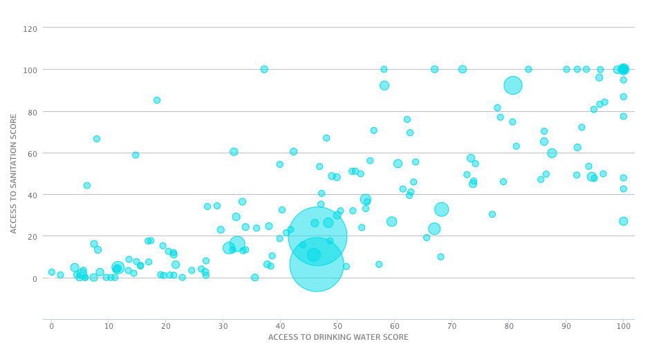
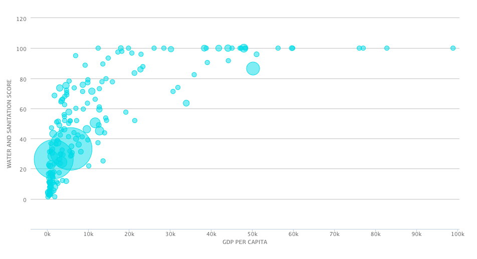
In our first analysis with the EPI data explorer we compared access to drinking water score to the access to sanitation score. We generally found that access to drinking water scores increased as access to sanitation increased and vice versa, though there is a high degree of variability. We then compared the composite score of the water and sanitation with GDP per capita, and saw a noticeable correlation between the two variables.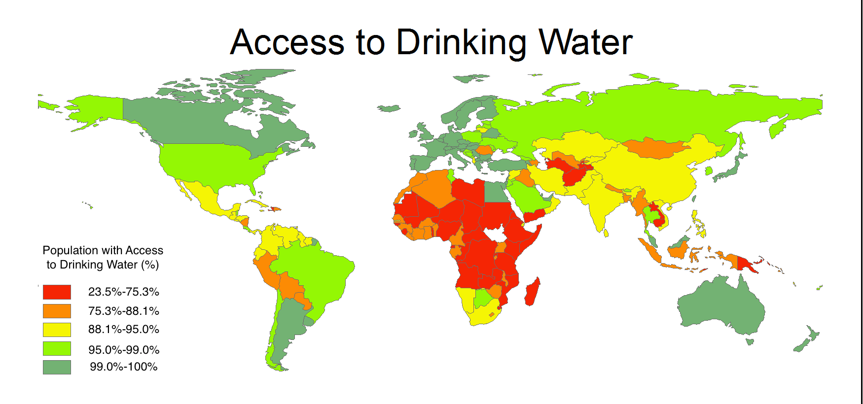
Our spatial analysis revealed how this relationship between national wealth and the population’s access to drinking water and improved sanitation plays out on
the global scale. Most of Europe, the United States*, Canada, Australia, New Zealand, Japan, the “Asian tigers” (Singapore, South Korea, and Taiwan), and several countries in the Middle East and South America had the greatest access to water and sanitation, with 99% or more of their population having access to clean piped water, and 98% or more having access to improved sanitation. Sub-Saharan Africa stands out as having particularly poor water and sanitation access; the vast majority of the region is composed of nations in which less than half of the population has improved sanitation, and less than three quarters of people even have a reliable and clean source of water. South Africa, Botswana and Namibia display the greatest access to drinking water in this region, with more than 88% of the population having improved water sources, though these countries have more limited access to improved sanitation, falling in the lowest or second-lowest quintiles for this measure globally.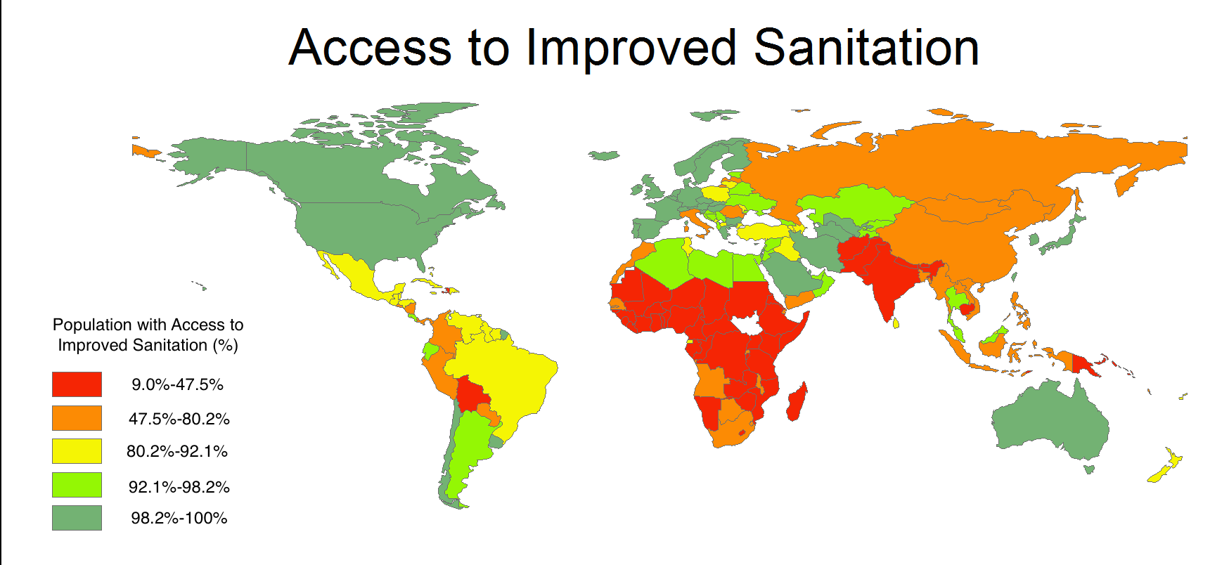
Outside sub-Saharan Africa, scattered nations throughout Asia and Latin America display low access to improved water and/or sanitation. Peru, Bolivia, Paraguay, Nicaragua, and Haiti fall below world average access to both drinking water and sanitation, and notably below the systems in neighboring countries such as Argentina, Chile, Uruguay, and Costa Rica. In the Middle East and North Africa, we see both large differences between neighboring nations and a large gap between access to drinking water and sanitation. Egypt, Saudi Arabia, Israel, Qatar, Kuwait, Jordan and the United Arab Emirates all rank in the top two quintiles for water and sanitation access, while Sudan, Yemen and Morocco rank in the bottom two for both. Iran, Libya, Algeria and Oman all have notably higher sanitation access relative to their water access, while the reverse is true in Turkey. Throughout South and Central Asia, the link between drinking water access and sanitation access grows more tenuous, as the post Soviet states of Kazakhstan, Turkmenistan, Uzbekistan, Tajikistan, and Kyrgyzstan each fall in the top two quintiles in terms of sanitation access, and the bottom three in terms of water access. In India, Bhutan, Pakistan, and China, however, sanitation access lags behind water access. In southeast Asia, Cambodia, Laos, Indonesia, Papua New Guinea, Myanmar have significantly less access to drinking water and sanitation than neighboring Thailand, Malaysia and Singapore.
Discussion
While there is a large degree of variability within regions regarding water and sanitation access, the overall geographic divide in this issue is clear. We see that concept of the Global North and Global South emerge in the heavily green and heavily red areas of these maps; the data clearly shows that there are vast differences between developed countries and poorer nations regarding water infrastructure. This spatial pattern holds true for both water and improved sanitation access, though there are noteworthy nations for which this relationship in more nebulous. Middle-income nations seem especially prone to greater relative access to either water or sanitation, a fact which may reflect the limited, though existent, resources these countries have in investing in access improvements for their growing populations.
Further spatial investigation with more variables mapped could provide insight on this global inequity in access to water and improved sanitation. A map controlling for GDP per capita, for instance, would help show which countries are over-performing or under-performing on ensuring access to water and sanitation relative to their economic resources. Additionally, comparing this data to historical data would reveal which countries have made great, recent strides in providing and protecting clean water, and which lag far behind the Millenium Goals set on this issue. Lastly, spatially examining the provision of water and sanitation for urban and rural populations in each of these countries could deepen our understanding of its distribution. The raw WHO/UNICEF data breaks the national data down into these parts, but mapping this data would go a step further in terms of helping us appreciate how water access varies within nations.
Finally, there is an issue of error within the EPI data sets. One of the results which stood out most to me in our map of access to improved sanitation was stark contrast between the data for Italy and that for the rest of western Europe. In this data set, Italy is grouped with countries like China, South Africa, Botswana and Venezuela, with between 47% and 80% of the population having access to “improved sanitation.” It did not make sense to me that 20 to 50% of Italians use an open pit or public latrine, so I dug into the data cited by EPI, the WHO/UNICEF Joint Monitoring Programme for Water Supply and Sanitation. I found that the source had no information for the sanitary facilities in Italy. The true source of the raw data for Italian sanitation (if there is one) is uncited. New Zealand, similarly, displays surprisingly poor performance in terms of its’ population’s access to improved sanitation, when considering its status as a developed nation. For New Zealand, the WHO/UNICEF data on sanitation improvements is largely missing, with only improved sanitation access for rural areas in 1990 listed.
*the raw data from WHO/UNICEF shows that 99.2% of American households have access to piped/public drinking water; the fact that the United States is categorized in the second-tier of countries in our map is owing to oddities in the EPI data, which assigns it an “access to drinking water” value below that of Kuwait and Bosnia and Herzegovina.