After reading my last post on OPAL’s antipathy towards Trimet and a detectable bias against rail, my advisor, Jim Proctor, prompted me to investigate the organization’s path dependency—the way in which earlier decisions/events have generated a certain institutional orientation which is continually reproduced within the organization. Essentially, what made OPAL so anti-Trimet?
There’s a couple detectable anti-Trimet narratives expressed at various times. They include themes about it wanting to be a development agency rather than a transit agency, about their privileging of rail over bus investments, about its bureaucracy’s “progressive paternalism,” the management’s anti-unionism, and its vision of its riders as being younger, more able, and more privileged than they really are. Currently, most of OPAL’s work seems directed around being an oppositional force. Different organizers express and justify this work as either being the force which makes Trimet accountable or as a natural reaction against Trimet’s actions. After digging into OPAL’s institutional history a little bit, I found that it was founded in 2005 by two community organizers working on environmental justice issues, Jonathan Ostar and Kevin Odell. Ostar, interestingly, was a Lewis & Clark Law School alum and is a current adjunct professor at the Law School. He stayed with the organization under last year and seems to have been a driving organizational force.
Initially, OPAL was “focused on disproportionate indoor and outdoor air quality and asthma concerns in communities along the I-205 freeway corridor.” (opalpdx.org, History) This itself had been a shift from Ostar and Odell’s earlier focus on air quality issues in North Portland public housing, geographically shifting as the working class and nonwhite population in Portland shifted east. It then transferred into working on gentrification and equity issues, with the focus on transportation seemingly having come in 2009, with the recession and its consequent service cuts. This was about the time that Odell left the organization for OnTheMove, a Boston-based and rail-friendly transit advocacy and transportation equity group. During the service cut crisis, OPAL discovered some shoddy accounting practices at Trimet and the fact it had given upper level staff raises while increasing fares and cutting service. They mobilized people around this, culminating in several packed and hostile public meetings. This series of clashes and confrontations with Trimet seems to have institutionally established an adversarial relationship between OPAL and Trimet.
Over this past week, I also talked with Bob Goldman, a sociology professor at Lewis & Clark who’s interested in issues of both food politics and gentrification. He was pretty impressed with my work so far and was very interested in my topic. He characterized gentrification in Portland as being in a new stage—one of scattershot development rather than the wholesale neighborhood transformations we saw earlier in North Portland. In this scattershot gentrification, it’s individual underutilized lots or decrepit structures which get developed more densely, with little spatial clustering of the developments. He characterized this new gentrification as bringing density without amenities, pointing to his own neighborhood in Southwest Portland, which has seen some dense development but not rezoning to allow commercial structures. Essentially, the most fertile sites for gentrification in Portland have been exhausted. Goldman also pointed to the Urban Growth Boundary as having unintentionally contributed to gentrification in Portland, restricting the supply of land and driving redevelopment inward. I questioned him on the unintentionality of that connection, as gentrification is pretty obviously positive for municipal governments—they get more revenue in property taxes. Additionally, the rhetoric justifying and defending the UGB usually includes a valorization of its densifying effects on urban development and its ability to create “walkable” neighborhoods (which Bob Goldman categorized as a dogwhistle for gentrification).
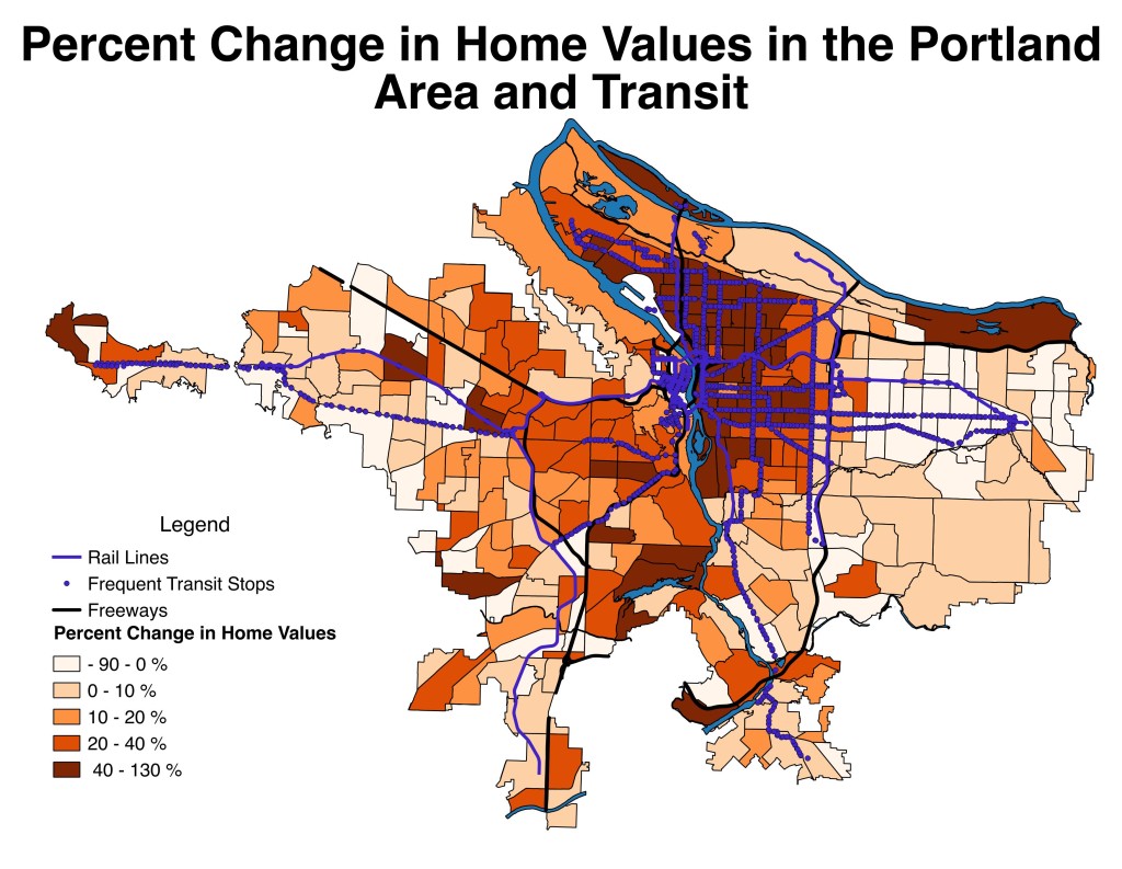
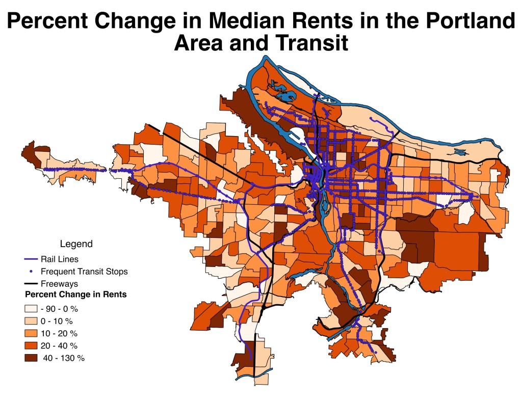
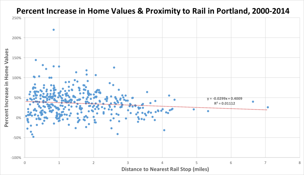
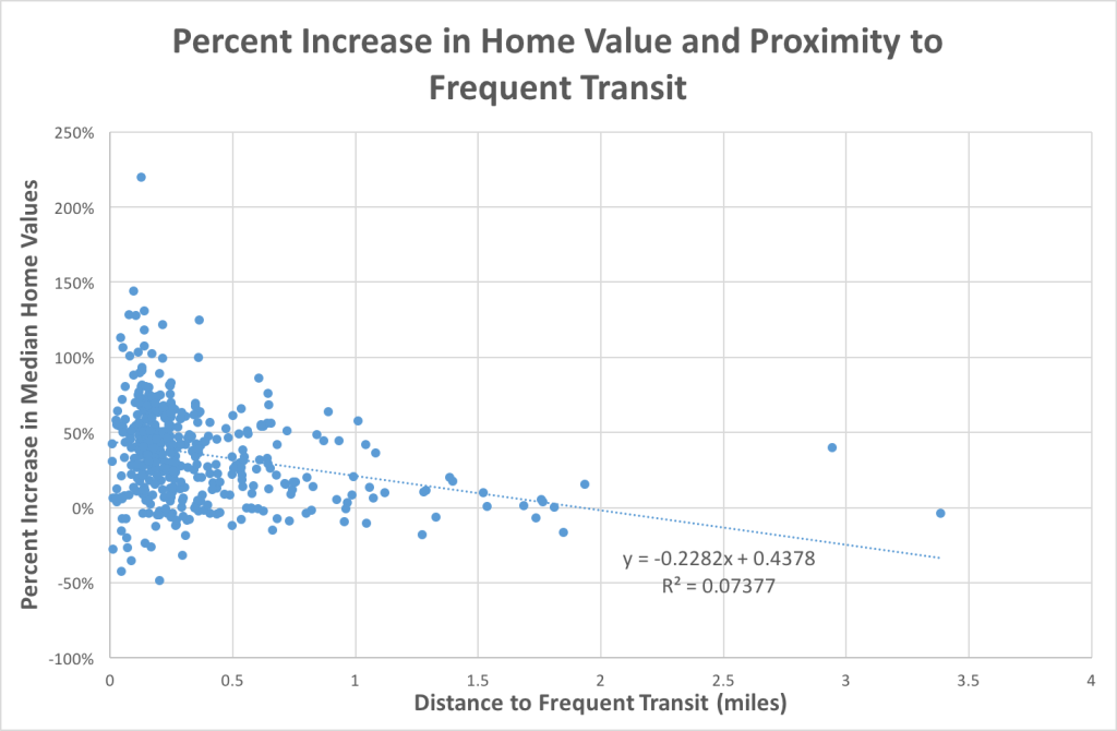
In terms of GIS and statistical work this week, I followed up on the regional examination of the correlation between frequent transit proximity and housing value appreciation, creating the maps and scatterplot below. I used census tract data for this map, as the manual massaging I did for the Portland block group data seemed too time-consuming to do for the entire metro area. I also created a variable of the distance to downtown by duplicating the census tract center-point layer and eliminated all of those except the one according to the downtown census tract. I found roughly the same level of correlation between distance to frequent transit stops and housing value and rent appreciation at the regional level as I’d found in Portland.
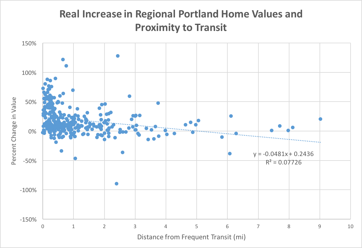
Over this past week, I also downloaded an open source version of SPSS and have been using it to analyze some of these 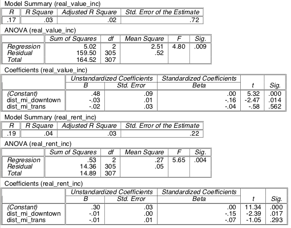 correlations in my data. To the right is a linear regression run from the regional census data for real increases in value and rent 2000-2014 and distance to frequent transit stops and downtown. I could use some more statistical training to assess the strength of these correlations and what exactly each of them means. In particular, if there is a given standard of R, r-squared, p-value, or F values I should set as my baseline for significance, and the difference between the ANOVA and Coefficients analysis. To add to my statistical analysis, I began making an quick and rough indicator index of gentrification, classifying it as a change in a home values from below the median value to above the median value.
There are several previous studies that have created an index of gentrification in Portland, including “The Gentrification and Displacement Study,” produced by the City of Portland and the “Gentrification in America Report” from Governing. I have some pretty severe reservations about both of these indices, especially the one by Governing. In their analysis, they classify census tracts as gentrifiable if their median housing value and median household income were below the 40th percentile of metro area median census tract values at the start of the period analyzed. They then say that the tract gentrified if the change in a tract’s educational attainment and housing value was in the top third percentile of all tracts in the metro area. Their definitions of neighborhoods which gentrified in Seattle are patently absurd based on a local knowledge of the city. They exclude 90% of the tracts as “not eligible for gentrification,” leaving only a handful of relatively peripheral neighborhoods and South Lake Union as possible areas where gentrification could occur. Their analysis highlights Georgetown, South Park, and Highland Park as the hotbeds of gentrification—three neighborhoods which remain poor relative to the city, have seen little development or renovation in the last twenty years, are surrounded by light industry in the case of the first two, and lack sidewalks or commercial amenities in the case of the latter two.
Their measure of Portland aligns more significantly with the city’s report on gentrification and media rhetoric about gentrification, but it still excludes more than half the census tracts from analysis. While a previously poor area significantly increasing in housing values and socio-economic characteristics is obviously gentrification (with potential quibbles about the cut-off points for each of those numbers), I don’t think that description is completely inclusive of gentrification as a process. In particular, I don’t think that process is immediately irrelevant if a census tract has above the area median housing value or socioeconomic characteristics. The vernacular understanding of gentrification in cities only very roughly aligns with these census-tract based measurements and I think that, in many ways, such vernacular understanding actually aligns more closely with theories of gentrification than the indices do. Pinning down a definition of gentrification is difficult, but, in my view, a few factors are obviously in play: appreciation of land/housing values and displacement of old residents by people with a higher socio-economic status, within areas with a predominately prewar/pre-car urban form. I think the second aspect of this definition is captured well by the census data, but the other two are more difficult to properly quantify. I’ve found it is quite problematic that these indices measuring gentrification based on housing data completely ignore the gentrification of prior industrial lands, which is a huge aspect of gentrification. If your measurement says that the Pearl District hasn’t gentrified in the last twenty years, your metric is incomplete.
Taxlot data is, in my view, critical to moving forward. It’s a huge pain to work with, as you get about 180,000 features for a city and have to let GIS run for about 20 minutes to do any basic transformation (clipping, measuring, dividing, etc). Nevertheless, there’s a lot of great data embedded within those tablet files, including an assessment of land value and improvement value. For Portland, this data is mostly locked behind a paywall at the RLIS site, but you can access a map of individual taxlots, including the land value by year going back to 1997, by clicking on the Assessor Detail button at Portland Maps. I manually queried a rather random and unscientific set of lots in different areas of the city. In general, I found that most areas of the city had roughly tripled in land value in nominal terms since 1997. East Portland lots and Central Eastside industrial lots roughly doubled in value, with some faster increases around Gateway. Pearl District lots usually quadrupled or quintupled in value (except for condominiums, which apparently are noted as having a land and building value of $0) , and North Portland lots increasing by a factor of around 6 or 7, with even more extreme appreciations in land value directly beside commercial, pedestrian-oriented arterials with mixed use zoning designations—the land at 3810 N Mississippi, a new mixed-use complex, is worth 31 times its value in 1997.
Mapping the direct land value at the scale of the lot gives a much more accurate and geographically nuanced assessment of the influence of transit and zoning policy on land value and value appreciation. Additionally, mapping the land improvement value against the total value of the lot provides a rather good proxy for the rent gap—while land value is not exactly the same as the potential value, it is a direct indicator and component of that value. Lots on which the value of the building comprises a very small portion of the overall market value could likely be replaced to raise the overall market value significantly, either by renovation and adding new tenets or complete redevelopment. For example, this lot, along with the two adjacent lots, had land values significantly above the improvement value in 2015. Right now, they’re the rising shell of a 5-on-1 mixed use complex that’s across the street from OPAL. OPAL’s structure is, as of the last three years, worth less than the lot it sits on.
There are several possibilities for getting the Portland tablet data. The County Assessor’s database is apparently accessible from publicly-accessible computers in its building, so that could be a way to download the data. Also, I could email someone at Metro and ask if they could send me the data. The data is also on ArcGis Online, but it will only show and export 1,000 features because of a limit in ArcGIS. And finally, one of my group members is interning for Metro and said he could get access to the data—he tried to sent it to me yesterday, but only sent the layer file.


