This map might look very similar to the map I posted last week — and it is, but it also includes some other crucial data. This map now displays areas relative hazards in Portland split up into zones: Zone A being the highest danger (red), and Zone D being the lowest (pale yellow). These hazards include landslide, amplification, and liquefaction depending on the topography and substrate of the area. Overlaid onto those zones are areas with either crosshatches or double crosshatches. The single crosshatches indicate areas with a combined population of 18.2-27.4% people of color (Black, Asian, Native American, Pacific Islander, Hispanic/Latino), while the double crosshatch indicates 27.4-40.4% (the maximum in Portland) of people of color population in a given neighborhood. I chose these numbers because as I mentioned in my last post, Portland’s 2012 Vulnerability Analysis indicated that populations with over 27.4% people of color were more susceptible to displacement, so the double crosshatches are already at risk while the single crosshatches could be at risk in the near future.
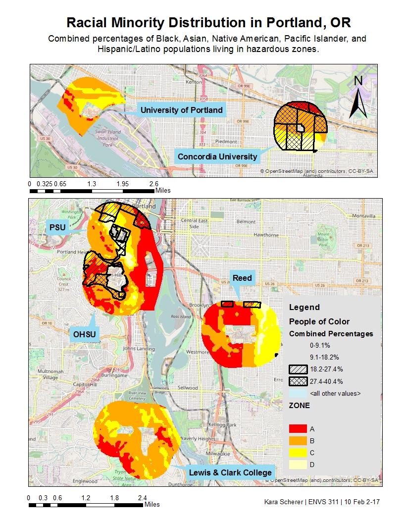
This map indicates that in terms of having populations of 27.4% or more people of color living in a Zone A area, Concordia, Reed, and PSU are most at risk. All have relatively small Zone A areas that intersect with communities of color, but regardless that small area could hold a lot of people. After looking at this map, I realized we probably shouldn’t have excluded the college campuses from our Zone analysis. Inferring from the surrounding areas, it seems like most campuses fall in Zone B or C, but the majority of Reed could potentially be in the red. This is important to consider — perhaps Reed is not a good location to store or plan to supply post-disaster resources because it most likely will be just as devastated as the surrounding community. In this instance, it could be important to identify another trusted organization farther east that is out of the red zone that could be a refuge for the community. On the other hand, Concordia could potentially be in a good position to support their neighbors because although the campus is in a Zone B area, half the community will not be as heavily affected, allowing resources to go more towards neighbors in the north who are in the red zone. Another factor to consider is population density in those areas, so we know how many people to expect. I created a chart to illustrate how many people in communities of color lie in Zone A.
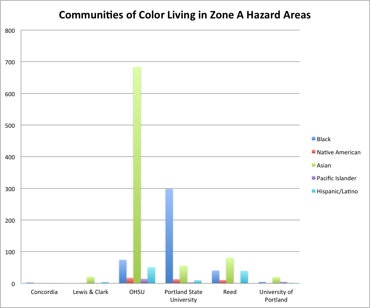
As displayed in the chart above, although Concordia, Reed, and PSU seem to be most at risk, PSU and OHSU actually have the most people at risk, pointing to a higher population density in that area. Upon viewing the map, OHSU doesn’t seem to have that many Zone A areas overlapping with communities of color, but perhaps the high population density contributes to a hidden population that could potentially be at risk. If we were to repeat this project, I would identify other trusted organizations in the neighborhood that may be in less affected zones, and recommend that they accrue resources from the surrounding community to support neighbors in the event of a disaster.