Part I: Recreating Graphics
Graphic designs such as those through Gapminder, founded by Hans Rosling, allow stories to be told using data and facts that many people believe to be difficult to access and understand. Tools like Gapminder can allow the dissemination of difficult to understand information through the use of visuals. The storage of data from many databases all over the world also allows the study of relationships within a variety of different factors, including time.
As the Geology 170 course is primarily studying energy production and emissions, both variables can be compared with any other variables ranging from per capita GDP, life expectancy, total health spending, CO2 emissions, population growth, and urban population growth. Both the X and Y axis can enhance the display of these variables, as well as the size of the bubble that represents any given number. For example, Figure 1 displays an X axis of per capita carbon dioxide emissions, a Y axis of per capita GDP, and a bubble-size that displays the cumulative carbon dioxide emissions of each country on record. The graphics also provide a time component in which any selected country can also track the variables over the recorded time, as seen in the watermark behind each Gapminder graphic.
Figure 1. Per capita CO2, per capita GDP per country, and cumulative CO2 emissions. Press ‘play’ to view change over time.
These graphics have helped the Geology 170 class to better understand certain graphics in the course textbook, Global Climate Change by David Kitchen.
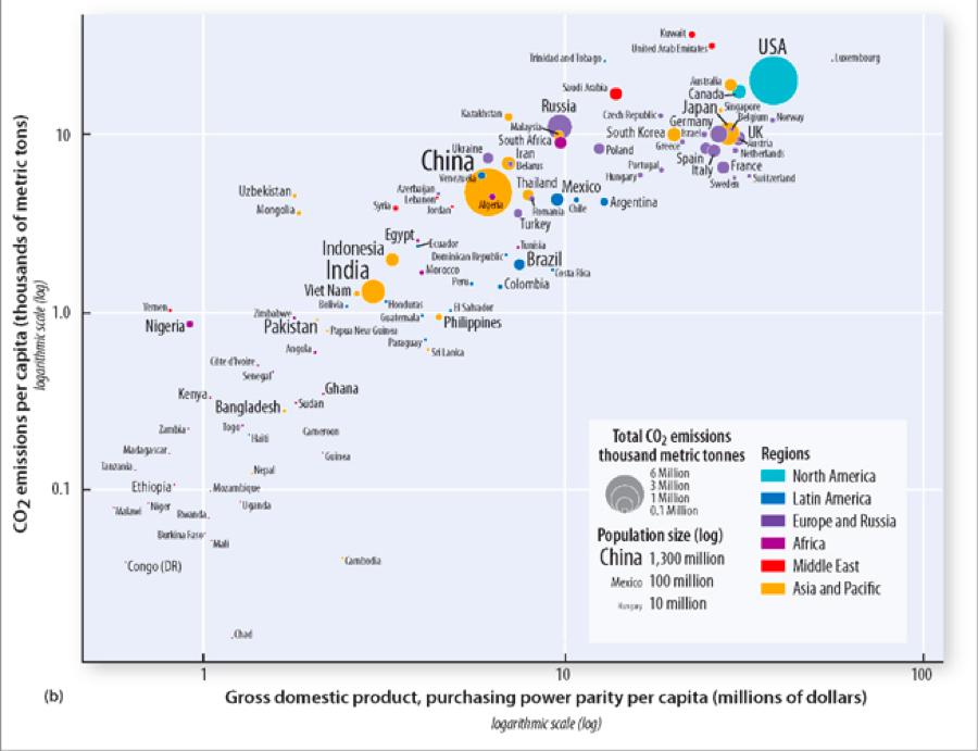
Figure 2. Graphic from Chapter 9 (p. 291) in Global Climate Change.
Gapminder is set to show data up until 2013 for these variables. The graph that I was able to build in order to replicate the graphic from Kitchen’s textbook suggest that the data from the textbook was from around 2008, which is seen as the bar on the bottom of the graphic in Figure 1 moves from the left to right, representing time.
It should be noted that data on gapminder is adjusted to account for fluctuations, particularly that of the economic data in Figures 1 and 2, and is harvested from the Carbon Dioxide Information Analysis Center (CDIAC).
Part II: Per Capita Residential Electricity Use and Carbon Dioxide Emissions
Carbon dioxide emissions have an intimate relationship with many questions about energy production and security, as many of the energy sources we are dependent on require CO2 emissions to either extract or use. Because of this relationship, I chose to take a look at per capita CO2 emissions (in tons) and per capita residential electricity use (in kWh) in different countries. In making this comparison, it is also important to note that the bubbles represent each country’s population relative to one another. This collection of data sets is only available up to 2008.
Figure 3. Per capita residential electricity use, per capita CO2 emissions per country, and population size. Press ‘play’ to view change over time.
By clicking on any bubble, you can find out which bubble represents which country. If you click on a bubble and then press play, you can also track the change of that specific country over time in all three variables (CO2 emissions, residential electricity use, and population size). Notably of Figure 3 are the bubbles that represent the United Arab Emirates (UAE), United States (USA), China, and India. All four countries have a drastically different relationship between variables, as captured in Figure 4.
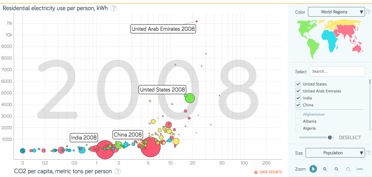
Figure 4. Per capita residential electricity use, per capita CO2 emissions, and population size of UAE, USA, China, and India in 2008.
Most notable are the high levels of both residential electricity use and carbon dioxide emissions per person for the United Arab Emirates, which lies at the top in electricity use and close to the top in CO2 emissions. The UAE is especially interesting because of the smaller population size. In fact, you can note in Figure 4 that most of the higher emitters and electric users are in fact countries with smaller populations.
In the case of the UAE, the country has a flat, desert terrain located in the Middle East that lacks freshwater natural resources. The country also has a highly urbanized population, with nearly 86% of the total population living in urban centers, namely Abu Dhabi, Dubai, and Sharjah (The World Factbook). This flight to urban centers is not surprising, given that the need for access to the electricity grid and water supply are so important in desert-like countries with booming economies.
The high emission of carbon dioxide also fits into the electricity narrative, as much of the electricity is reportedly generated using natural-gas fired generators, driving up the per capita emissions of the country especially as the country’s population grows (Library of Congress).
In addition to residential electricity use, the amount of energy that the UAE uses to desalinate water is reported at almost 30% of the country’s total power consumption (Gulf News). In fact, the high rate of energy use for desalination plants combined with high residential electricity demand due to growing populations has led to a total energy demand that is pushing the energy sector to the brink. An article in the Gulf News reported that, “The U.A.E. is pursuing plans to diversify its energy mix beyond fossil fuel-fired electricity generation through the use of nuclear and solar. Inefficient consumption of electricity and the reliance on energy-intensive water desalination plants are expected to drive growth in power demand in the near future.”
The story of the UAE’s energy use and CO2 emissions is just one of many on the graphic of Figures 3 and 4, and speaks to the complicated nature of energy systems and how they relate to other sectors. For a thorough understanding of many different aspects of the United Arab Emirates, I suggest the UAE Country Profile from the USA’s Library of Congress.