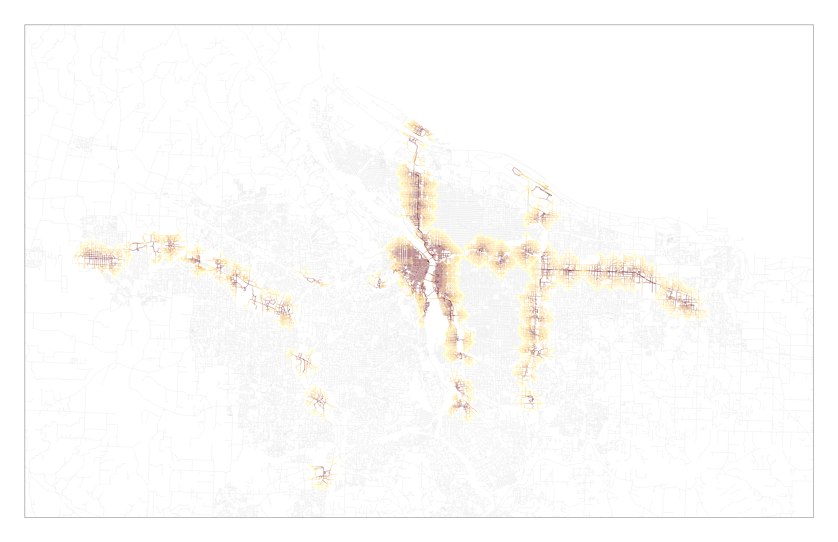
Over this past week, I’ve started working through my methodology, focusing primarily on how I will conduct my analysis of network-based (i.e. walking, rather than as-the-crow-flies) distances to transit stations. This work has been quite fruitful, and I found ArcGIS’s Network Analyst tool immensely useful for generating the transit isochrone maps I envisioned. I first built a network from the street network shapefile from RLIS in ArcCatelog (excluding highways and freeways). From there, it was relatively straightforward to use the service area analyst tool to create line and polygon maps of the distance to the nearest rail station, posted below. This line map shades the streets within 1 mi of each rail station in the Portland area, with different shades used for each .2 mi increment:
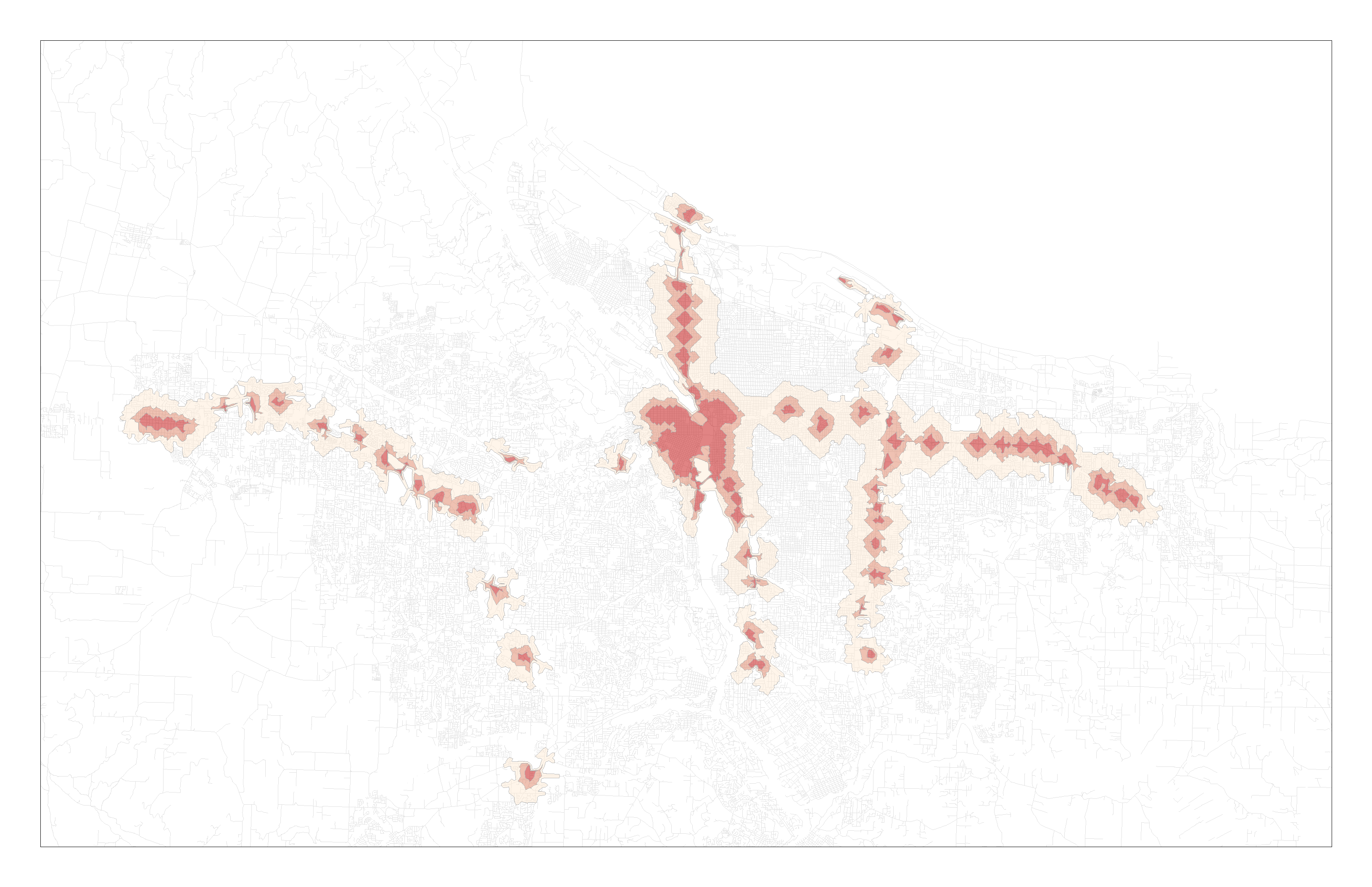
 This polygon map shows the area within .25, .5, and 1 mi of rail stations by network area:
My next steps for analyzing this data will be to focus the study area on the one or two corridors which I will be using and find a way to associate the parcels with this network analysis.
I also went back and read through three sources I’ve accumulated over the past half-year of research. Bartholomew and Ewing (2011) conducted a literature review of hedonic analyses of the price effects of transit on land value. This article lays out the basic elements of hedonic analysis, noting the characteristics controlled by most hedonic models (those related to structures—square footage of living space, the number of bedrooms and bathrooms, the presence of a garage, the age of the house, etc—and those related to land—proximity to amenities and disamenities). They then survey, summarize, and synthesize the existing literature on the hedonic price effects of transit, categorizing and grouping these effects as access-related effects and design-related effects. They conclude that the literature confirms that the value of pedestrian- and transit-designed development is being capitalized into real estate prices and that the valuation of transit accessibility and TOD-based design are linked synergistically.
Mackenzie (2013) analyzed neighborhood access to transit in 2000 and 2009 in relation to demographic data in the Portland metro area. He measures transit access as the average network-level walking distance from each housing parcel within a block group to transit, considering the transit accessible if it’s within 1/2 of a mile of light rail or 1/3 of a mile of bus stops, and summing the number of accessible routes for each parcel in order to find the average number of routes accessible by transit for each block group. He used Moran’s I clustering technique to categorize neighborhoods as having concentrations of poverty and racial/ethnic minorities. He then conducted a regression analysis and controlled for population density, job count, working age population, and percent of people renting, with postsecondary education, and no vehicle. He found that neighborhoods with a high concentration of black and Latino populations experienced a decline in transit accessibility from 2000 to 2009, though high poverty neighborhoods overall actually saw in increase in transit accessibility.
Leave a Reply