For the first week in second semester of my thesis, I created a concept map of the actors and processes important to the creation and implications of the Orange MAX Line. I ended up departing fairly significantly from the process outlined by Canas et al. (2015), who describe concept mapping as large concepts linked in a coherent structure by simple prepositions. This is somewhat contrary to the Actor-Network Theory (ANT) diagrams called for by the ENVS guidelines, which link specific actors with specific prepositions. While concept mapping as envisioned by Canas et al. seems useful for schematically illustrating the broad arc of an argument and I will undoubtedly at least sketch out such a map to help with the big-picture organization of background ideas and theories, my familiarity with ANT made it a more attractive model for organization. The basic structure of my concept map consists of the actors and planning components engaged in the production of the light rail line itself (generally the left side), along with the effects of the line and planning as embodied in institutions and objects (generally the right side). Color coding enhances the immediate readability by visually grouping the types of actors mapped and allowing for a quick view of the overall network structure. To decide on the actors to include, I began with those essential to my broad-scale argument—the light rail line itself, the major governmental organizations involved in its creation, developers and transit-oriented development in general, and the housing market. I elaborated on the linkages surrounding the housing market to sketch out the nature of the causalities. Considering my focus on planning in this thesis, I also found it important to include the route and station area planning as separate nodes in the network, along with the EIS. I debated including the EIS, as my main argument concerning the EIS is how it both ignored how potential property appreciation could be detrimental to some and became the main focal point for the planning process.
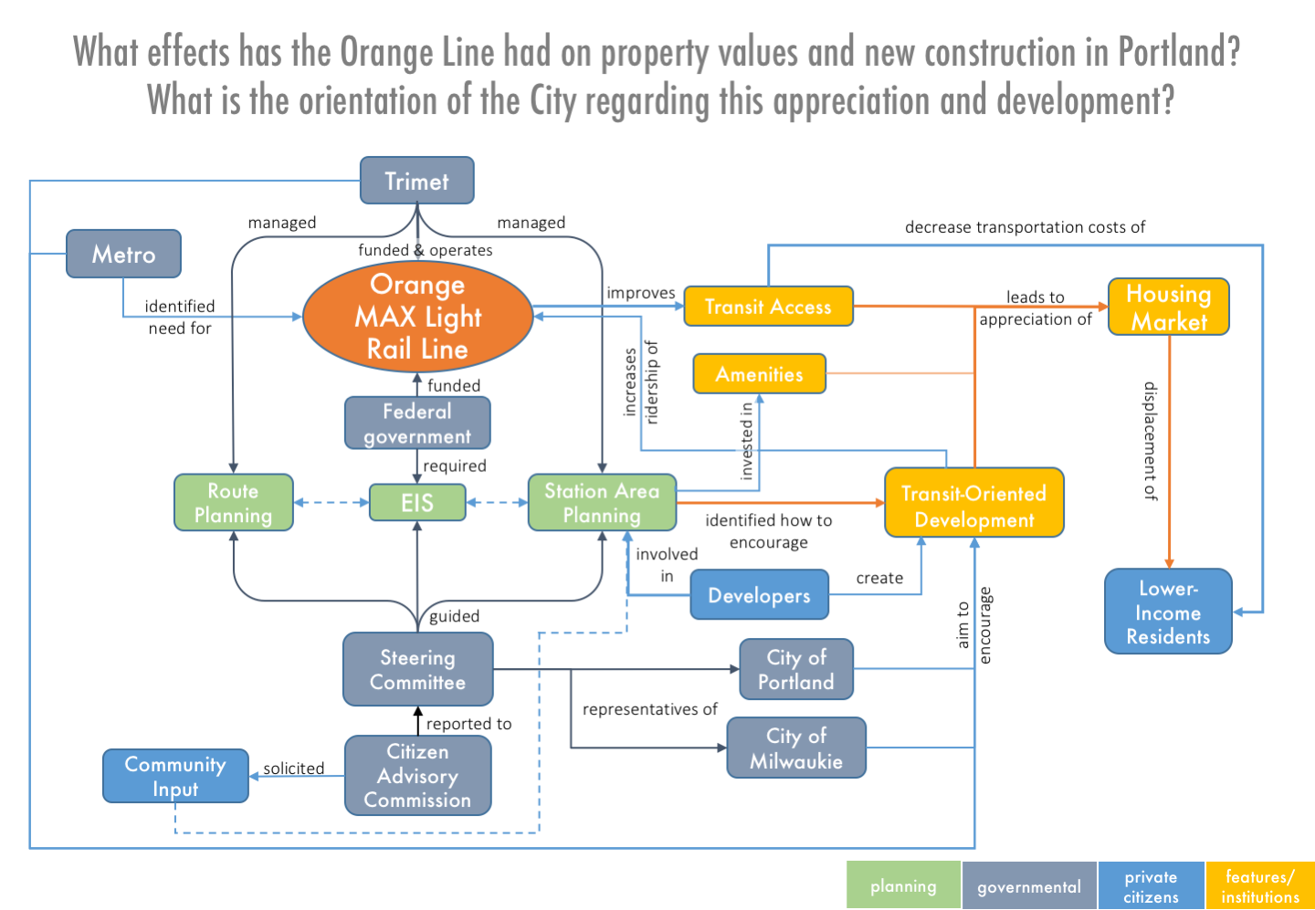
To organize this network, I proceeded from the basic design of the two hemispheres of actors highlighted above—the direct transit planning and the associated land use planning and outcomes. I was inspired by the Canas article to add a level of hierarchy within the left hemisphere, while most of the rest of the map functions as a flowchart. The black lines illustrate formal governmental hierarchies that comprise background information on the structure of the planning process, blue lines highlight those processes which are important to the overall development of my argument and easily demonstrable, and orange lines represent the core, debatable assertions in my thesis. The central point of this concept map is the centrality of promoting transit-oriented development and its attendant land value creation, in terms of the priorities of the governmental actors shaping policy, station area planning itself, the success of the line, and housing market appreciation. It also illustrates some of the tension in equity planning, with transit access simultaneously enabling cheap mobility for lower-income residents and sparking some price appreciation. Community input is comparatively marginalized, consisting largely of minor input solicited by a sub-commission, after the major decisions had been made. Developers, by contrast, occupy a central role within a regime intended to encourage transit-oriented development, possessing both a substantial voice in the station area planning process and being the subject of planning.
Concept mapping was strikingly different from writing, as I was able to avoid entirely the issue of supporting arguments, placing short linking arrows as though they were facts. I had to ignore that inner voice shouting “but that’s not capturing any of the nuances!” as I created the concept map, plowing on through the generalities that college has made me recoil from. I think this exercise was most helpful in getting me to really focus on what the chain on arguments consists of. While creating the concept map, I found myself connecting each link to a specific source or set of arguments; laying them out as such helped show me which arguments are really debatable and which are only necessary to the extent that they set up components of the thesis. On one level, this map is incomplete, showing the decision to create light rail as emerging ex-nihilo, from the assessment of Metro and/or the desires of Trimet. Obviously this is not the case, ignoring both regional history around early failed attempts at making this Portland-Milwaukie light rail route as well as the broader ideological and material motivators for creating light rail (e.g. objection to sprawl; opposition to new highway construction at several scales; planning principles of growing compactly, including a desire from the City of Portland to capture more of the regional growth; an agency bias towards flashy light rail construction; real mobility needs; support for expansion of light rail as building the Portland brand). Including all of these factors and their interconnections, and then painstakingly organizing nodes and edges for clarity, went beyond the level of concept mapping I thought appropriate for a paper not focused on the history itself.
Jesse, what software did you use to build this concept map?
I just used the box and line shapes (Insert>Shapes>…) in Powerpoint.