Now that I have mapped the distribution of renters around college campuses, it is time to look at the possible hazards that those communities will likely face in the event of a subduction zone earthquake. Using data collected about the geological state of Portland, a hazards map was created by the state of Oregon to determine where the most damage would occur during an earthquake. The data takes into consideration the affects of liquefaction (due to water in the soil), amplification (due to large sediment composites), and landslides (due to slope combined with the other two attributes). The hazards were compiled and a map was created using four different zone types (A,B,C, and D), with zone A being the most hazardous and zone D being the least.
As a class we took the relative hazard data and mapped each zone. We then layered on a map of our college campuses and a half-mile buffer around them. Within each census data polygon from our previous maps, I then added a third layer that shows (by figure size), the amount of renters within each zone.
Looking at the combination of each zone and any given attribute is important in understanding who is most likely to be affected by the quake, and the possible difficulties that they will have to recover.
Looking at a big picture map like this one helps to understand the large scale impacts of the potential quake. For example, you can see that there is a lot of potential hazard near the rivers (both the Willamette and the Columbia). This is most likely from liquefaction hazards. You can also see that the East side of the Willamette is most likely bedrock, with little hazard of liquefaction or amplification, while the West side, near Beaverton, is bright red. This would most likely be due to sediment that will likely amplify the tremors of the earthquake.

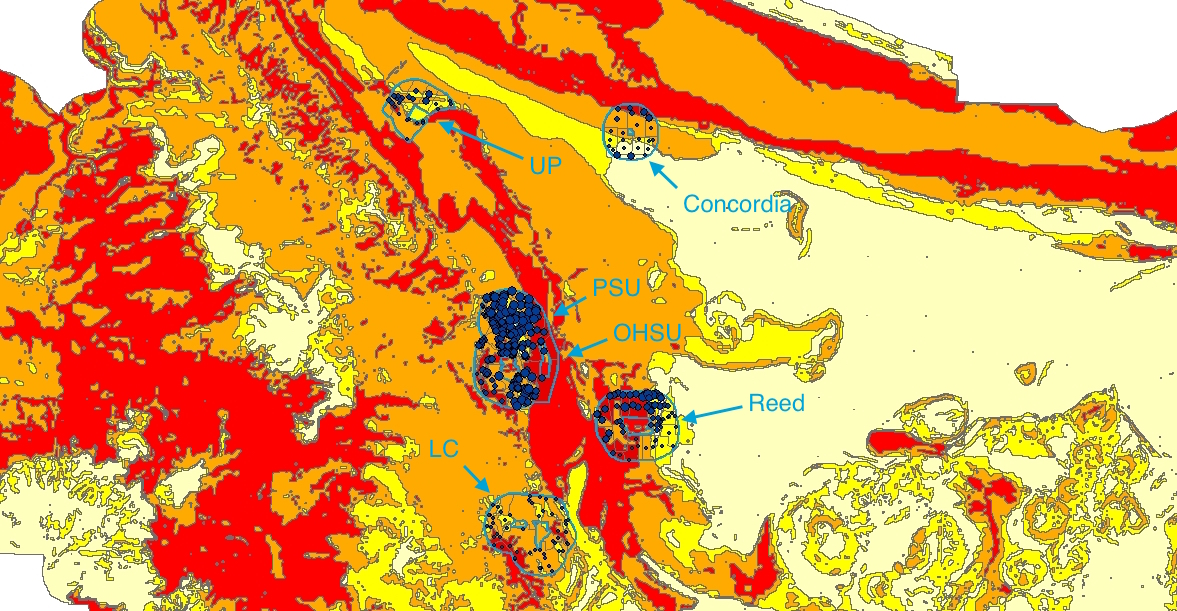
Looking more closely at our selected schools, it is important to note where the zones and added attributes overlap. For example, in the previous mapping that I did, the number of renters around PSU and OHSU were significant, and much higher than that of Reed College. However, when added to the relative hazards map, it is important to note that most of the PSU half-mile is in Zone B, while almost half of the Reed half-mile is in Zone A. Additionally, the campuses themselves for OHSU and Reed are a mix of Zone A and B, while PSU is actually in a small pocket of Zones C and D. The significance of this is about whether of not the colleges would be able to actually help the surrounding residents. Will the buildings even survive the initial shaking? These are all important things to consider when looking at how and if these college campuses can be part of the post-disaster relief community.
These maps can help visualize where danger zones are, and where schools are in relation to them. But one thing that is difficult to understand through them, is exactly who will be in the most hazardous of these zones. I created a graph looking at five of the six schools that are mapped (excluding Concordia college). In this graph I calculated the number of residents within a half-mile of each campus living in Zone A, the most hazardous. I then assorted each group by attribute and graphed the number of renters in Zone A, as well as the number of people making less that $25,000 a year, and the number of residents who have a high school diploma but no Bachelors degree. I chose these two attributes because I felt that they were most likely to affect the type of apartment that would be available to the residents.

This graph narrows down neighboring residents by more than just a half-mile. This shows residents within a half-mile that are also in Zone A. Interestingly, this data shows that OHSU has the most residents in all three attributes. This will most likely mean that they will be the school with the most residents in need of help. This could be due to the high number of apartment complexes near the lower campus of OHSU, which is near the water and likely to experience liquefaction. This is also concerning though, as the campuses itself is likely to experience damage from the quake. This data, and the maps above, makes me curious about the relationship between PSU and OHSU. The campuses of both schools are close together, and both have relatively large swaths of land exposed to Zone A level hazards. One huge difference, however, is the location of the campuses themselves. In the event of such an earthquake, I would suggest that OHSU and PSU coordinate in such a way that they are able to redirect residents to one of the three campuses (one PSU, two OHSU) that is least affected.