Introduction
Natural phenomena, such as earthquakes, tsunamis, hurricanes, etc., are often referred to as “natural disasters.” This phrase combines two aspects of natural phenomena: hazardous physical earth processes combined with the social effects of the event on human populations. Wisner et. al., defines disaster as, “a situation involving a natural hazard which has consequences in terms of damage, livelihoods/economic disruption and/or casualties that are too great for the affected area and people to deal with properly on their own” (2012, Box 3.2, para. 2). Many claim that disasters are nothing without humans, and the extent of damage from disasters is directly affected by the increasingly anthropocentric infrastructure we use, seen as early as 1756 from a letter written by Rousseau to Voltaire regarding a Lisbon earthquake, “If the residents of this large city had been more evenly dispersed and less densely housed, the losses would have been fewer or perhaps none at all” (para. 5).
We also know that, “while a disaster does indeed threaten everything in its path…disasters do not affect all members of society equally” (Fothergill and Peek, 2004, p. 89). It is for this reason that disaster hazards and demographic mapping is important. Portland rests on the Cascadia subduction zone, an area that is likely to experience a megathrust earthquake sometime in the next 50 years, likely a 9+ magnitude earthquake. In the event of such an earthquake, different Portland residents will be exposed to different hazards, and at different scales. In an effort to better understand the distribution of these hazards, and the vulnerable communities that will likely be exposed, we mapped hazard distribution and demographics within a half-mile of six different colleges and universities. These institutions are important for a number of reasons, namely that they support a large and wide range of people for day-to-day functions, and will likely be looked to as support from students and community members.
Methods
As a class, we decided that mapping this information through ArcGIS, followed by statistical analysis through Excel, would be the best way to represent our findings. We started by overlaying Census data on a map of Portland. When mapped in ArcGIS, the Census data is divided into polygon “communities” that can then be manipulated to display the percentage of a given attribute per polygon. We chose to multiply the percentages given by the total population in Excel because actual population numbers are important to understand the scale any hazard has on an area. Next we mapped a half-mile buffer zone around six Portland college campuses: Lewis and Clark College (LC), Reed College, Portland State University (PSU), Oregon Health and Science University (OHSU) , University of Portland (UP), and Concordia University. In order to do so, we clipped the pre-existing data to represent either the whole or fractional polygon communities that exist within the half-mile buffer zone. During part one of our mapping, we used our clipped data to represent certain Census data attributes within the buffer zone, such as age, gender, income, race, renters, and education. Each attribute can help determine the extent and way in which an individual, family, or community are vulnerable during an earthquake.
During part two of our mapping, we added a map layer that showed the distribution and level of hazard. The data for the map takes into consideration the effects of liquefaction (due to water in the soil), amplification (due to large sediment composites), and landslides (due to slope combined with the other two attributes). The hazards were compiled and a map was created using four different zone types (A,B,C, and D), with zone A being the most hazardous and zone D being the least. The combination of Census data attributes and hazard mapping allows us to see which communities and attributes are likely to experience relative amounts of hazard, which can help us understand the likelihood of recovery and self-sufficiency. These overlayed hazards were applied to all previously mapped attributes : age, gender, income, race, renters, and education.
Results
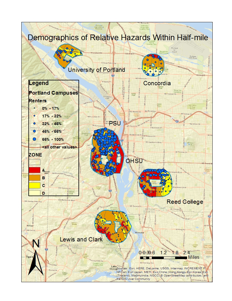
Figure 1. ArcGIS map of Concordia, UP, PSU, OHSU, Reed, and L&C. Includes hazard zones and renter distribution. Hazard zone A is most hazardous, zone D is least hazardous.

Figure 2. Statistical analysis of Census data, compares combines renters and owners to visualize ratio.

Figure 3. Compares only data within half-mile buffer that also falls under zone A hazards, includes attributes of income level, home-renters, and education level.
Looking at a big picture map, like that of Figure 1, helps to understand the large scale impacts of the potential quake. For example, you can see that there is a lot of potential hazard near the rivers (both the Willamette and the Columbia). This is most likely from liquefaction hazards. You can also see that the East side of the Willamette is most likely hard bedrock, with little hazard of liquefaction or amplification, while the West side, near Beaverton, is bright red. This would most likely be due to sediment that will amplify the tremors of the earthquake.
All three figures suggest that while there are small patches of zone A level hazard and renters in all 6 campus neighborhoods, the renting communities near PSU, OHSU, and Reed are the most at the most risk. Each of the three location have a top three total population, renters population (as well as income and education disadvantages), and have significant amounts of zone A level red on the map.
Figure 3 shows that with the added hazards layer (which is not present in Figure 2), the data can more definitively tell that OHSU has the highest number of at-risk renting populations. This connection would be difficult to draw without combining the data and hazards as we did.
Discussion
Knowing that OHSU, PSU, and Reed College all have high at-risk renting populations can tell us a number of things. First of all, the number of renters number is not surprising to see in downtown Portland, where almost all housing options are apartments. Renters can be vulnerable populations because they lack the ability to take individual action in preparation, such as earthquake retrofitting. They also often live in tall apartment buildings that can possibly crumble or collapse, or be crashed into by other buildings. However, when looking at Figure 2, the number of residents below $25,000/year is almost one-third that of the total renting population. This is important to note because while renting can be a vulnerability, income can also help determine the quality of the housing.
Secondly, because PSU and OHSU are in downtown, they are also much closer to other resources and possible evacuation points, such as sports arenas, churches, etc. They are also much closer to governmental facilities, and are perhaps more likely to receive aid first. This creates a two sided problem: downtown campuses are more likely to have vulnerable populations in high hazard areas but may have other resources nearby, while sub-urban campuses have fewer people, included less vulnerable renting populations, but are perhaps farther away from extra resources. This leaves Reed College, which has a relatively large vulnerable population in high hazard areas, and is far enough away from downtown that it might have less city resource availability.
A third reflection of the data prompts the question of what happens to the actual campuses during this megathrust earthquake. It is perhaps safe to say that the campuses for UP, Concordia, and L&C will be relatively safe, but OHSU, PSU, and Reed are a different story. If all three campuses have such large swaths of zone A hazard, will the structural integrity of the campus survive the earthquake? Will they be able to provide support to surrounding communities?
This data, and the maps above, makes me curious about the relationship between PSU and OHSU. The campuses of both schools are close together, and both have relatively large swaths of land exposed to zone A level hazards. One huge difference, however, is the location of the campuses themselves and where the hazard zones intersect the campuses. In the event of such an earthquake, I would suggest that OHSU and PSU coordinate in such a way that they are able to redirect residents to one of the three campuses (one PSU, two OHSU) that is least affected.
An important perspective of data analysis to think about in this context is that the information is only a possible narrative, not truth. All three figures, and the implications of them above, help us to consider possible scenarios of disaster relief, but should not be taken as the correct version of events. This is one reason why improvisation is such an important tool of resiliency post-disaster: you can make an educated guess what life will be like post-disaster, but you can not know for sure until it is time.
Resources
Wisner, Ben , JC Gaillard and Ilan Kelman , “Framing Disaster” , in The Routledge Handbook of Hazards and Disaster Risk Reduction ed. Ben Wisner , JC Gaillard and Ilan Kelman . (Abingdon: Routledge, 13 Dec 2011 ), accessed 17 Feb 2017 , Routledge Handbooks Online.
Rousseau to Voltaire, 18 August 1756, from J.A. Leigh, ed., Correspondence complète de Jean Jacques Rousseau, vol. 4 (Geneva, 1967), pp. 37-50; translated by R. Spang.
Fothergill, Alice, Lori A. Peek. (2004). Poverty and Disasters in the United States: A Review of Recent Sociological Findings. Natural Hazards 32: 89–110