In our third exercise in GEOL 340 Problems in Spatial Science, we developed a whole new set of skills that allowed us to analyze the shifted demographics of Chicago city from 1990 to 2000. Building on our previous skills, we were able to use publicly available data, display spatial data in 3D form, and use a two-variable analysis to observe any potential correlations. Our ultimate goal was to understand how racial groups spread (or shrunk) in Chicago and whether this change occurred seemingly randomly or was influenced by economic factors.
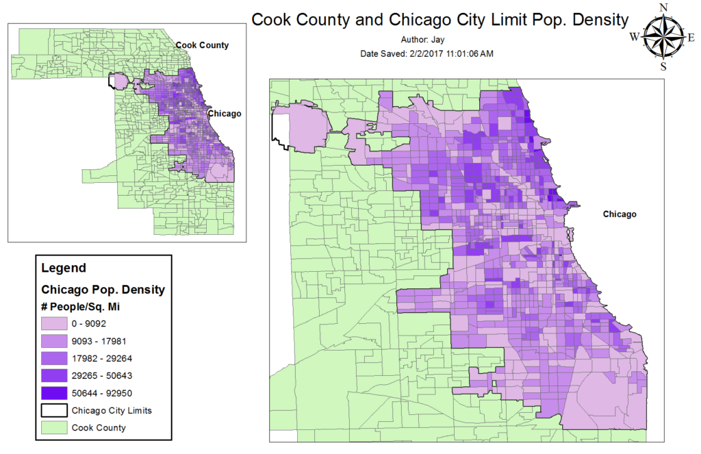
- First of all, we need a map showing the Chicago census data for year 2000 and population densities per square mile in each polygon. The below map reveals that the population densities within Chicago’s city limits (shown in purple). It seems as though Chicago’s populations are heavily concentrated in the north-eastern areas.
- Next, we needed to observe and compare the racial makeup of Cook County. We decided to display African American, Hispanic, and White populations in both 1990 and 2000 as percentages of the total population within each tract for year 2000. Although it may be challenging to realize the pattern using just a static map, the flicker effect on ArcGIS allowed us to see more easily the shifting racial makeup of each polygon. In general, African American populations seems to have spread further out in the southern half of Cook County. Conversely, the year 2000 hispanic population hasn’t moved into a notable number of new areas but have rather increased their representation within the polygons that they were already living in in 1990. Overall, the white population is comprising a smaller percentage in much of Cook County. This may be due to a growing number of minorities in those areas or that whites are leaving those counties. A surface observation of the physical geography of Chicago seems to reveal that white populations are centered nearer or adjacent to green areas while African Americans are centered nearer the inner-city areas; however, statistical testing of this potential correlation would be necessary to move forward with any conclusive statements.

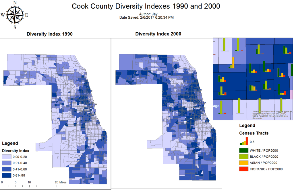
- Now that we obtained a general surface understanding of how racial makeups were changing in Chicago, it was time to attach numerical values – a diversity index – for further examination. By taking 1990 and 2000 census data for the number of people in each race group present in each polygon, we were able to calculate a single number that would represent how “diverse” that polygon was. For clarification purposes on what constitutes a “high diversity” polygon, the map below contains bar graphs of racial makeups in certain polygons. One can clearly see that polygons with “low diversity” are such because of a high representation of one race group. Conversely, one can see that “high diversity” polygons have visible representation from two, three, or four race groups. The county-wide diversity indexes reveal an overall diversification of Chicago.
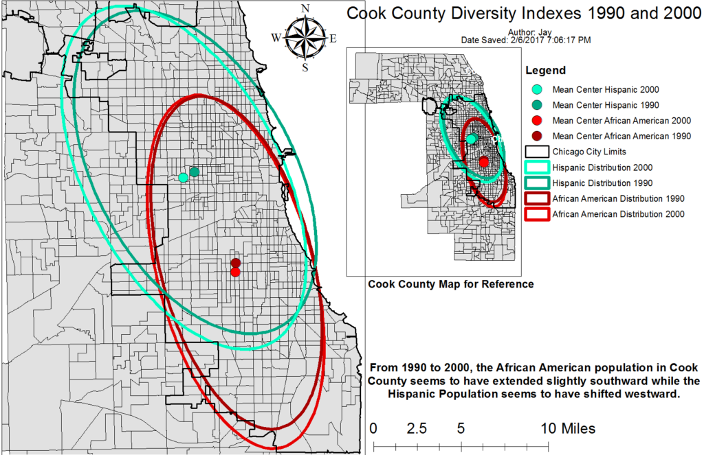
- Two useful tool in GIS to observe the overall patterns in shifting populations are the mean center and distribution tools. Referring back to observations made in step 2 regarding African American and hispanic population’s shifting to new areas, we hypothesized that African American populations were spreading further south but that hispanics were remaining relatively static. The map below shows the averaged shift in those two populations from 1990 to 2000 and supports our hypothesis for the African Americans but not for hispanics. While mean center and distributions are averaged values and thus not terribly useful for small shifts, it serves as a tool to support or counterdict any surface patterns one might see in dynamic populations over time. I can imagine that these two tools would aid wildlife biologists in observing the recovery of species of concern/interest.
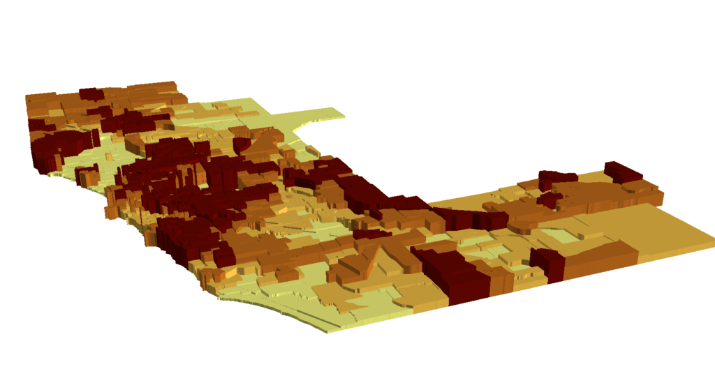
- ArcGIS is a powerful software capable of displaying data in 2D and 3D formats. In order to introduce ourselves to the software’s 3D capabilities, we created a 3D map showing the diversity index values for year 2000. While a static image may not be the most useful representation of the below map, it is nonetheless a good practice in spatial thinking.
- Using median house values is also useful when observing shifting demographics in Chicago, for it is an economic indicator. We pulled median house value data for Cook County from factfinder.census.gov. The below map shows this data in a map representation and histogram form. This data was also represented in a 3D format. Some of the most expensive properties are right on the shoreline in highly concentrated neighborhoods, a pattern similarly seen in comparable areas like Manhattan, New York.

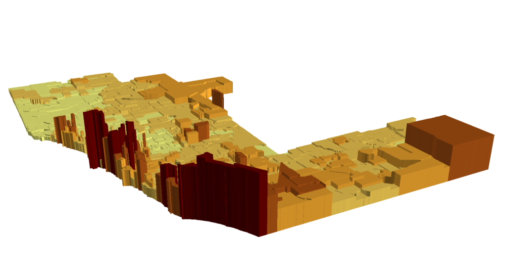
- Now to compare two variables: representation of race and median house value. In each of the polygons, we compared these two values to see if areas with certain race groups had higher or lower median house values. The resulting three images show these two variables for hispanics, whites, and African American populations. % of population in each polygon of the race group in question (normalized to year 2000 census data) was shown in graduated colors while median house values were shown in “elevation,” or the 3D component. This two-variable analysis reveals a disturbing trend of whites representing the majority in areas with high median house values while African Americans and hispanics are primarily residing in areas of lower median house values.

African Americans
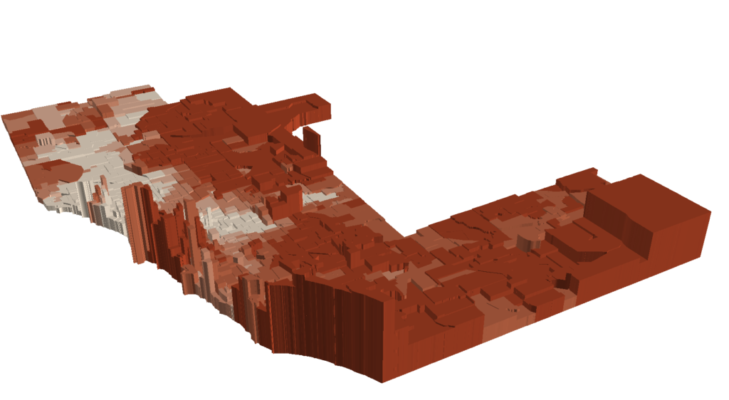
White
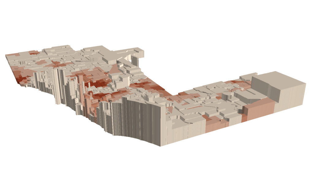
Hispanic
Conclusions & Reflections
Chicago is an example of a diverse city – usually looked upon as a good characteristic – but our GIS analysis of the city’s racial makeup, where these racial groups reside, and the house values (a good indicator of economic rank or status) in those areas reveal a very different story. Overall, it seems as though in the decade since 1990, Chicago became more diverse with more places containing two or more prominent racial groups. Still, much of the areas with high median house values are places where whites reside, showing that there is an economic divide between minorities and whites. For city officials and residents alike, this information is valuable to getting a better understanding of just what is going on – and what may be to come – in a diversifying but racial-geographically stratifying Chicago
In terms of the exercise itself, it was definitely ambitious. Compared to the last exercise, this demographics exercise with Chicago seemed to bump up the GIS analysis skills required by a few levels. Still, the maps created showed clearly the GIS applications to demographics, and playing with GIS’s 3D capabilities were eye-opening. Moving forward, I hope to do an exercise that serves the purpose of reinforcing our newly acquired skills before moving on to introducing new tools and analysis techniques.


Leave a Reply