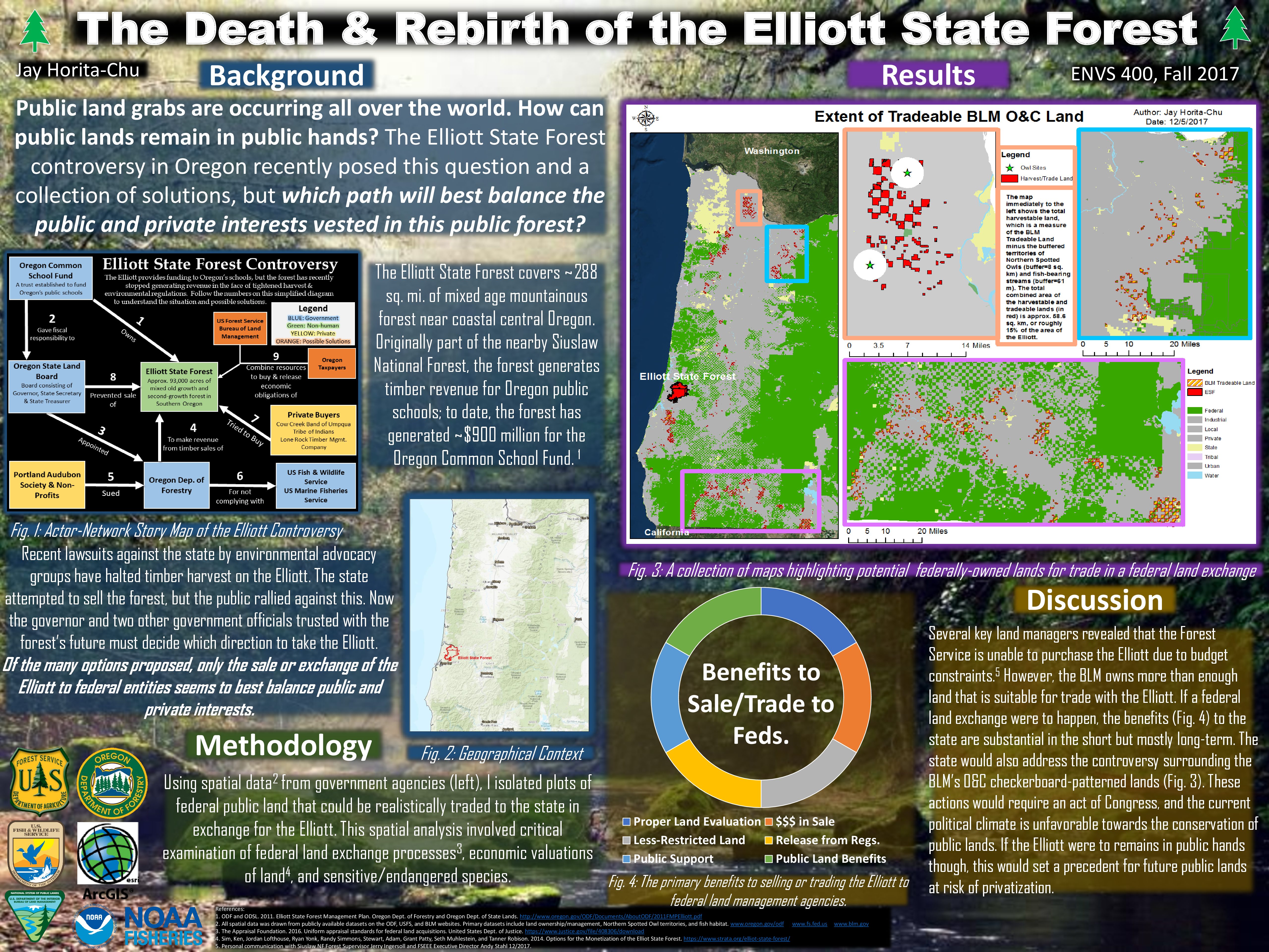
While I started pulling some spatial data off the internet some weeks ago, this week I managed to do some initial spatial analysis with the data! It’s exciting to brush off my old ArcGIS skills and gain new ones as I move forward with step one of my methodology.
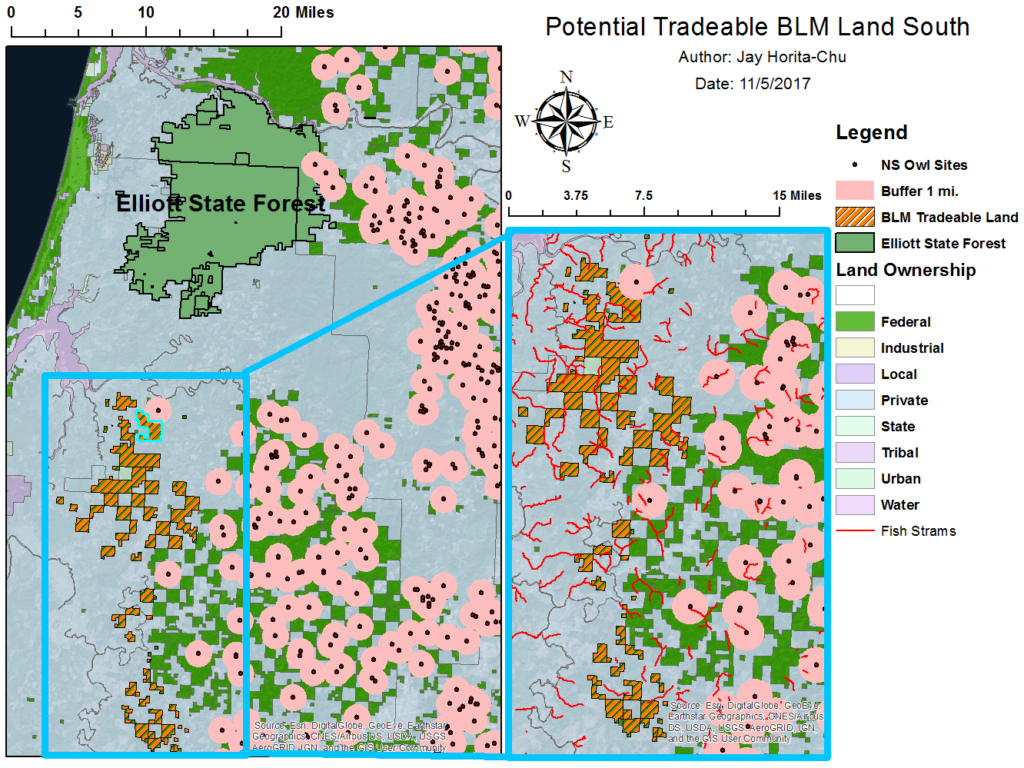
While in no way complete and polished, I figured I’d make a quick map of my progress thus far. In my first GIS analysis, I looked at what BLM lands could be traded for the Elliott State Forest. I isolated several plots of BLM land south of the Elliott. The red dots represent Northern Spotted Owl habitat, and just to get an idea of the land requirements of the owl, I placed 1 mile buffers around each confirmed nest. Obviously, the habitat requirements of the owl are more complicated than placing just 1 mile buffers around each nest site, but for primary analysis, it’s not a bad start.
What constituted “tradeable” land?
Primarily, I found plots of BLM land without a confirmed Northern Spotted Owl nest. Secondly, I consolidated lands that were heavily fragmented in terms of land ownership. If you see the smaller map in the image below, you can see that there are very small fragments of federal BLM land scattered about. Thirdly, I picked plots of land without a high concentration of streams bearing endangered or sensitive fish species (salmon, steelhead, and bull trout).
Looking Ahead
- I will need to do a little more digging into the status of these lands I’ve chosen; why are they so heavily fragmented (beyond the standard checkerboard pattern)? What and how much natural resources do these lands contain (ex: volume of harvest-able timber)?
- Repeat this methodology for lands beyond the scope I looked at this time, which means father south, north, and east!
Great start to step 1 of my methodology.
Leave a Reply